Friday, April 30, 2010

sushi love

once again last night i set out to meet some challenges, but this time i actually MADE THEM--hooray! :) i used sketch #19 from 365 cards...

...i grabbed the recipe from this week's elements challenge from the design dollies... (to use 3 patterned papers from the same manufacturer; a tag; an uncolored stamped image; red ribbon; & something lime green) ...and i put it all atop a lovely base of kraft as per the current jacksonbelle embellishments challenge.

(digital papers & elements: sushi tonight , gina cunningham, tyggereye art...printed on kodak photo paper & avery label paper; additional elements: patterned paper: scenic route + text from a japanese workbook; tag: k&co; heart stamp: hero arts; ribbon & jump ring: michaels; diamond glaze: judikins; heart dies: cuttlebug; adhesives: tombow monorunner, 3m foam tape, sewing machine)

i used gina's gorgeous sushi tonight minikit again, i just love that thing! this time i cut out the chopsticks and the sushi, mounted it on foam tape, and used a little bit of diamond glaze to give the roe an extra glossy dimensional look. i layered all of the elements according to the sketch and highlighted most everything with loads of ink and plenty of machine stitching. sushi, anyone??!

Thursday, April 29, 2010

i had several challenges in mind...

...when i started this card.

for example, the current theme at jacksonbelle embellishments is to use kraft as the base of your card; design dollies' monday color challenge is to combine craft with bright colors of your choice; and both 365 cards and 2S4Y have particularly nice sketches this week. all of this was in my head, but somehow *NONE* of it came out in the card. go figure. about halfway through i realized what was coming out in the card: the gorgeous "crazy trousseau robe" stef and i saw at the folk art museum's women only exhibit last week:

i did actually start out with a kraft base...it just somehow got a bit consumed by the loads and loads of pink scraps that make up my "crazy card" base. i glued everything down, then machine-stiched a bit wonkily around the scraps and the entire perimeter. i hand-stitched some flourishes in pink...which actually didn't show up quite as well as i was hoping...so i enhanced them a bit further with a michaels' rhinestone flourish. the coat didn't have any flowers, but cards kind of need a focal point, so i stacked a few florals and it wound up looking a bit like this:


(kraft cardstock: bazzill; patterned paper: doodlebug, crafty secrets, prima, paper co, basic grey; florals: amanda blu, doodlebug, marah johnson; embroidery floss: dmc; rhinestone flourish: recollections; ink: colorbox; adhesives: tombow monorunner, 3m foam tape)

so now that this thing is out of my system, maybe i can work on some of those challenges, eh??! :)

Tuesday, April 27, 2010

my top ten new york highlights


10. foods of ny's chinatown food & culture tour (not just for the food...but wow...the food was GoOOoooOOoD!) i learned more about the history of chinatown in 3 hours with our guide rajim than i have in 20 years of (sporadic) visiting on my own!


9. visiting the american folk art museum for the women only exhibition, and finding we'd serendipitously landed at henry darger headquarters ...a month after seeing the film "in the realms of the unreal".


8. the victorian collage display, playing with pictures, at the metropolitan museum of art. (my favorite museum in the world...maybe my favorite place in the world?!)


7. the view from the rather glorious top of the rock observation deck at rockefeller center...the sheer awesomeness of being there at night...the fact that we went on the spur of the moment and somehow avoided all the crowds & lines...the nice girl who took our photo...the guy with the i-phone who showed us mars and venus and some of the constellations.


6. staten island bryan ferry! it's easy...it's efficient...you cannot BEAT the views of the harbor...and wouldja believe: it's FREE!!!


5. the holy trinity of divine sticky toffee pudding experiences in 3 different modalities (warm with custard, takeaway cupcake, and a tin for home) at tea and sympathy. yum. (YUM!!!)


4. the 1920's paris photographs at international center for photography... (where, ironically, visitor photography is prohibited) ...and the 1920's paris paintings at the guggenheim...and the fact that we saw them--with no knowledge or pre-planning--on consecutive days.


3. the "scavenger hunt" for menus and postcards and brochures and cool packaging to make a travel book...and watching it come together a bit more every night


2. sitting outside the hotel on our last night, just hanging out and watching new york happen before us, in the cool air and the fading sunshine of yet another beautiful spring day.


1. spending 5 days with someone who doesn't think it's weird that fine art, sushi menus and manhole covers...amongst other randomness... make me think of cards!!! (PRICELESS!!!)


***********

eta tuesday morning: i was so tired when i set this up last night that i forgot to mention my eleventh favorite nyc thing: the awesome summaries the divine stephanie has been posting for each day of our trip! not only are they MUCH more logical than my ramblings, she has more--and better--photos, as well! (check out day 1, day 2, day 3) thanks, stef! ♥ (i did get my pics, such as they are, uploaded into a webshots album, finally.)

Monday, April 26, 2010

eenie, meenie, meinie, roe!

i love making funky, unusual-sized cards...right up until the time i have to photo them...at which point i generally vow to convert immediately to A-2's and never stray again! oy.

i mention this because the card you're about to see--made with the new tyggereye SUSHI TONIGHT digital mini-kit-- is accordion folded, with five 2.5 x 2.5" panels. it is ADORABLE in real life. i swear!!! just try to bear that in mind, ok?!

here it is folded up and tied with a bow...being square, it looks fine at this point:


i used some gorgeous green hand-printed paper purchased at pearl paint in chinatown last week; punched circles from some paper co. straw textured paper that's been in my stash for aaaaaaaaages; and for this card i scaled gina's fabulous sushi elements quite small and printed them with their drop-shadow option on matte cardstock. then i used a very fine copic outliner (".1" to be specific) to go around the image and add highlights for a "hand-drawn" sort of look. expanded half-way, the card still looks pretty good:


it was when i tried to photo the entire thing that everything went awry. i just could not get a pic where you could see EVERY frame without it being tiny, crooked and just generally awful; and i'm totally out of time, so we're just gonna go with the best of the worst and call it a day, ok?!


as you can see... (sorta!) ...each panel has a circle, a sushi, and a dymo label. sequentially they read: "eenie, meenie, meinie, ROE!" and then the last panel says, "how about sushi?!" it really *IS* very cute indeed, irl, HONEST! but don't take my word for it, grab up your very own copy of sushi tonight from gina's etsy shop and see for yourself! :)

Sunday, April 25, 2010

it's probably not *IMPOSSIBLE* to take a bad photo of the guggenheim...

...but it's definitely quite difficult. case in point: even a notoriously bad snapper such as myself can produce some pretty good pics. wanna see?

it looks good full on:


it looks good in profile:


it looks good as a surrealist composition:


it looks very good indeed as a minimalist construct:


and yes, even its nether regions look pretty good:


ok, maybe it IS impossible to take a bad photo of the guggenheim, but next time you're in new york, do swing by and have a go! whilst there, you might also like to enter the iconic frank lloyd wright building...they have some pretty nice art inside, as well!!! :)

if you're going to be there before september, you'll be able to see the current exhibition, HAUNTED, which stef and i saw & highly recommend; it is quite remarkable! here is a link my lovely friend sent this morning, it's video on the guggenheim's website in which the curators and some of the artists discuss the show. even if you're not particularly interested in this installation, the video gives a wonderful sense of what the inside of this utterly unique museum space is like: how the art is displayed, how each piece is connected and yet separate from the others, and how the visitors flow through it. if you've been to the guggenheim it will remind you why you love it...if you've never been, it might just inspire you! (thanks, stef!!!) ♥♥♥

Saturday, April 24, 2010

2 sketches for...SUSHI!!!

having been away from home for 5 days i found--as always--the only things i really cannot live without are lovely husband jeff and the ability/time/supplies to be crafty!* which is why, even though i have laundry galore, dust bunnies the size of tumbleweeds, and enough unanswered emails to wallpaper paraguay, what i did last night was clear a lauren-shaped hole in the living room and make a card using laura's sketch #50. hey--a girl's gotta do what a girl's gotta do, right?! :)


and of course we all know that no matter how many fabulous supplies we possess, the thing we will always want to use most is whatever's brand new! in this case, i had been given a little sneaky peek at the new tyggereye art digital minikit: SUSHI TONIGHT!

strictly speaking, it's not out until next wednesday**...but i just COULD NOT WAIT! i had to have a little play ! it's really gina's fault...if she expects me to practice restraint, she's going to have to start making these things considerably less awesome!!! (& trust me folks...it ain't gonna happen!) i made a hybrid card, just because i really needed to do some real life cutting and pasting!


(digital elements: sushi tonight minikit, tyggereye art; patterned paper: rouge de garance, basic grey + text from a japanese workbook; black glossy cardstock: ranger; adhesives: tombow monorunner, 3m foam tape, sewing machine)

once again, when i cut out the little pieces of sushi i was holding a second layer--in this case of plain black paper--behind the print-out so that in addition to the elements i had silhouettes of their shapes, also. these i glued just slightly offset behind each bit of fishy goodness to make a sort of drop-shadow; i love how that looks! the word strips (which i welded together digitally to form that nice border) and sushi's are printed on photo paper for a little bit of gloss and shine.

in my original vision i had loads of layers of the kit's gorgeously grunged-up papers as the base of the card...it was beautiful and super-colorful...but then, when i went to glue it up, i set everything aside onto some black "rouge de garance" paper and it made the sushi panel *POP* so wonderfully...well, i changed the entire plan in midstream! after that, i decided it only needed a little bit of distressing and sewing to increase the "texture factor"!

more examples from the kit later this week...not to mention lots more new york photos! ♥

*i did work on my new york travel journal every night in the hotel; i'll post pics when it's finished, hopefully next week!
**update: it turns out, GINA couldn't wait either...the sushi kit is out *now*! HOORAY!

Friday, April 23, 2010

you know it's a good trip when even the paper towels seem happy to see you!


these particular paper towels were in the ladies' room at the neue galerie that is nearest to cafe fledermaus. i suspect that every face which has been anywhere near cafe fledermaus (or the galerie's other restaurant, cafe sabarsky) wears a similar grin. i know i was definitely sporting one on sunday, having eaten the most divine wild mushroom spaetzle you can possibly imagine, followed by a schwarzwalder kirschtorte* that might well have restored even nietzsche's faith in a higher power**, all washed down with deliciously fruity mango-ginger iced tea!

alas, the only problem with an absolutely AMAZING vacation is that no matter how wonderful one's real life is... (and being the lucky so-and-so i am, mine is gooooooooood!) ...it's hard not to feel very slightly aggrieved to re-enter a land where beds & bathrooms are not magically made up whilst one spends the the day wafting quite deliriously from museum to cafe to gift-shop! but hey, as "problems" go...i'll take it, gladly!!! ♥

*basically a chocolate covered cherry in cake form.
**or in the restorative talents of the pastry chef, at least!

Thursday, April 22, 2010

a hint as to where i've been this week:

any guesses???
nope, that's not paris...nor des moines...nor uttar pradesh...

need another hint?
check out the girl on the left:

yep, it's new york, new york--so good they named it twice!!!

ok, bonus round: wanna guess who was with me?
lhj perhaps?
nope.
not this time.

check out the girl on the right:

yes, indeed, it's the lovely miss stephanie... (who turns out to be even LOVELIER in real life!) ...she came all the way from iowa to hang out and do the tourist thang with me! (and boy did we have *FUN*!)

there's lots more, but if i show it all at once i fear i will cause unsafe levels of envy overload, so i'll sign off for now.

♥♥♥

Saturday, April 17, 2010

but is adventure ready for ME, we ask ourselves??!


i'm off on a little mini-vacation...back on thursday...i'll be checking in and checking email, but probably not much else.

have a FABULOUS week, darlings!!!
♥♥♥

Friday, April 16, 2010

heart the art double-header!

it's been a couple of weeks since i posted my heart the art pages, hasn't it? the reason being, i had hoped to take a *WONDERFUL* photo of the nieces and nephew on easter sunday to use on my week 14 page, AMAZED. sadly, i only took about a dozen pics that day... (too busy playing with the little varmints in question!) ...and wound up with only one photo of all 4 kids together! this was taken at the "little" supper table, had distracting elements on the table and in the background, and while it was pretty good of the girls, featured quite an unflattering image of my brother knelt down in the very center at the back!

what to do...what to do...

first i converted the whole thing to black & white and bumped up the contrast, which helped make the plates & cups & tabletop recede and brought the sweet faces into prominence. but it was still a really BAD picture, and my thoughts of being able to just layer some text over the offending bits were dashed. so i printed it on photo paper and set about covering everything except the kids in gesso. they looked a bit "disembodied"...but on the plus side it gave me lots of lovely room to do my journaling! when that was done, it looked pretty good, but was entirely black and white...which is much too tame for these whippersnappers!!! i wanted to make a funky ribbon frame like this (!), but i hadn't left enough room to go all the way around the edges. when i pulled out my ribbon box, i found a snack-sized baggie with tiiiiiiiiny scraps that i keep telling myself to throw away and it hit me: layered ribbon-scrap photo corners! (obviously, lol!!!) et voila:


(sei patterned paper; misc. ribbon scraps; may arts butterfly; heidi swapp & michaels $ spot rubber stamps; stewart superior india ink pad; liquitex gesso; kodak premium photo paper; uniball pen; gluedots, tombow mono adhesive runner, staples)


this week (#15) our word is SEARCHING.

(ranger cardstock; sei paper; snoopy cut from a magazine; dymo labels; ek success rub-ons; michaels sparkly foam star stickers)

the thing we are searching for, at the moment, is an answer to what is making lovely husband jeff dizzy. ordinarily, i would say it's his overwhelming love for me... :) ...but this has gone a bit past that now, and we think it's the leftover consequence of a bigtime ear/sinus infection he had at the beginning of the year that sort of kept coming back now and again. apparently, the inflamation has not gone all the way away, and he has got increasingly dizzy and even a bit nauseous. medication alleviates it somewhat, but it makes him very sleepy, which is not particularly helping him with his main goal, which is to be able to go to work and then DO THINGS whilst he's there. so we're still plodding along with doctors and so forth. hopefully an answer will present itself pretty soon. (i will keep you posted!)

this concludes my super-sized bonus round of heart the art pages, but why not check out the flickr group for more loads of art journaling fabulousness!!! ♥♥♥

Thursday, April 15, 2010

on your (book)mark...get set...GO!

you might just remember that a couple of weeks ago gina and i had another fab ATC swap, which we both really enjoyed. what you may have forgotten is that gina also made me a fabulous bookmark, and i promised to do the same.

yeah. i forgot, too...until about five minutes after i *mailed* my half of the ATC swap! but when i remembered i set right to work, and in pennance i made TWO bookmarks: a funny one featuring my all-time favorite groucho marx quote (the front is on the left, the back is on the right):

text reads: "outside of a dog, a book is man's best friend...inside of a dog, it's too dark to read"


and a pretty one, with a sort of vaguely french theme:


dymo-ed text reads, "ne perdex pas votre page"
which means...if my very small amount of french and the google translator are to be trusted...
"don't lose your page!"


believe it or not, in all my years of papercrafting, these are the very first bookmarks i've ever made! i doubt they'll be the last, however, as they were SO MUCH FUN to put together...and...a fabulous use of small paper scraps, leftover rub-ons, and the last stickers in the pack!


tonight, when you're done making a card, instead of cleaning up your table, why not make a bookmark instead?! (i bet you'll be hooked, too!!!) :)


**************


(~materials~ vintage: dog & book illustrations, sheet music, french text paper; patterned paper: pink paislee, creative imaginations, prima, sei, doodlebug, hambly transparency; rhonna farrer digital "french ooh la la" tickets; alphabet stamps: making memories; sticker: frances meyer; rub-ons: 7 gypsies; butterfly punch: martha stewart; eyelets: oriental trading; ribbon: heidi swapp; inks: colorbox & staz-on; other: dymo labels, raffia; adhesives: uhu gluestick; tombow monorunner)

Tuesday, April 13, 2010

best (hybrid) fishes!!!

hooray! i'm back for day two of the big tyggereye art digikit release party!!! as promised, today i have some hybrid cards made with images from gina's gorgeous kit, of the water. first up, i've used one of my all-time favorite greeting card sentiments, "best fishes" in a brand new way...on an anniversary card!

(additional materials: k&co, heidi grace & scrapbook wizard patterned paper; american crafts plastic ribbon; colorbox inks; recollections epoxy hearts; copic outliner; colorbox inks: sewing machine; tombow monorunner & 3m foam tape)

because, of course, the best thing about digi is: not only can you make the elements any size you want, you can use the "flip" command to make a mirror image, and thus you get *TWO* (or 20...or 200!) goldfish for the price of one!

(i should also mention that i made this card using kazan's sketch #50, which is rather fab...see?)


want to hear my favorite "fussy cutting" tip? it doesn't take any more effort to cut 2 or 3 layers than it does to just cut one. seriously. i staple a few extra sheets behind whatever i'm cutting...and in addition to the main image i get some fun silhouettes. this is great if you're paper-piecing, or you can use the extra images as masks for paint or glimmer mist; or you can dress them up a bit with a liner pen & some chalk ink for a completely different look:

(additional materials: autumn leaves & prima patterned paper + hindi newspaper; copic outliner; cherry arte crackle stamp; colorbox & ranger inks; dmc embroidery floss; mambi gem; tombow monorunner & 3m foam tape; coral printed on kodak photo paper)

here i've used another favorite technique--i placed the silhouette koi (cut from chinese newspaper) as a sort of drop-shadow for the one from the kit. i love how it gives me double dimension and interest...for exactly the same amount of work! i've also printed one of the gorgeous watercolor papers from the kit on a transparency and layered it over my "store bought" patterned paper for a completely unique background:

(additional materials: love elsie patterned paper; bazzill kraft cardstock; basic grey alphabet stickers; dymo labels; colorbox ink; copic outliner; sewing machine; tombow monorunner & 3m foam tape; kodak photopaper & 3m inkjet transparency)


just a reminder that all of these lovely elements are from this kit:

available at an etsy shop near you! now scoot on over to gina's blog and see some more "of the water" goodness! ♥

Monday, April 12, 2010

best fishes!!!

ok, i know a lot of people who read my blog love gina of tyggereye art as much as i do, so you're gonna flip over what i have to show you today: creations made with gina's VERY FIRST DIGIKIT, of the water now available in her etsy shop!!!


being the very verrrrrrrry lucky girl that i am, i got to have a little sneak peek over the weekend (thanks, g!) and i had a blast playing with this thing! the papers are GORGEOUS and watercolory...the elements (including one of gina's awesome goldfish!) are beautiful...there's an alphabet and a cool set of numbers and these great labels...and...well, how about if i stop talking so you can see for yourself?! :)


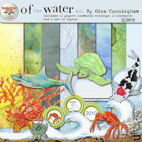
for my first digi-composition, i used the wave element as a clipping mask on several of the divine multicolored patterned papers in PSE. i gave them subtle drop shadows in coordinating colors, and layered them with the very handsome shark on a background of sky paper framed in ocean waves paper. the only thing i used from outside the kit was a font called "ma sexy", to give a little advice we all need from time to time: just keep swimming!

in the next one i used a fabulous quote from henri matisse, "i wouldn't mind turning into a vermilion goldfish"! i can't help but think matisse would've been even MORE enthusiastic about such a project if he'd had the option of turning into one of gina's gorgeous embroidered vermilion goldfish, don't you think?!


again, everything you see is from the kit, with the exception of the fonts (2peas platform shoes & mom's typewriter) and an a couple of anna aspnes' asian script brushes that i've layered in soft colors over the blue-green watercolor paper. the green textured paper, sized just slightly larger, makes a perfect frame in exactly the right color!

and now i know you're longing to go and see what gina made with the kit...so i will bid you a fond farewell until tomorrow when i'll be back with some awesome of the water HYBRID CARDS!!!

♥♥♥

Saturday, April 10, 2010

more luscious prima goodness

this time i've used shanna vineyard's gorgeous bonus sketch from 2 sketches for you:


(i had hoped to be posting this in addition to a card made from laura's sketch #49...but i ran out of time this week! )

the other night when i made the sketchy thursday pocket card, my plan was to cut some of the butterflies from the "flights of fancy" paper and place them in the diecut "window"...but then i found that sweet bird rub-on & went that way, instead. now i've come back to my first idea, and turned it into an anniversary card for my aunt and uncle.

(patterned paper: prima, love elsie, basic grey; chipboard word: ek success; florals: prima + vintage sprig dyed w/glimmermist; label die: nestabilities; border punch: fiskars; lace: making memories; glitter glue: stickles; other: sewing machine; adhesives: tombow monorunner, 3m foam tape, gluedots)


i am down to my last few "inspirables" chipboard words by ek success, and it is bumming me out big time that they do not seem to make 'em anymore! i bet i have bought half a dozen packs of those over the years, they are just *SO* practical! they're exactly the right size for cards...self-adhesive...in a decorative but readable cursive font...and self-adhesive! they're made of glossy chipboard, in sort of "usefully neutral" colors; but are easily altered with paint, ink or even a sharpie! bye-bye, lovely word art...i shall miss you!


so what obscure but vital papercrafting products do *YOU* mourn the loss of?
(tell, tell!)

Friday, April 9, 2010

birthday grrrrrrl

how awesome is this week's sketch from card patterns?!


yeah. i thought so too. especially if you have some funky patterns to do the little circles in. and where there are funky patterns, there might as well also be bling words...and tiny adorable skulls (there's a phrase you don't hear every day!) ...and zebra ribbon! you know, kinda like THIS:

(patterned paper: adrienne looman for prima, doodlebug, textured origami paper, and miscellaneous music note paper; glossy black cardstock: ranger; journaling card: adrienne looman for prima; bling word: mambi (it originally said "girly"...anybody need a rhinestone "y"??!); rub-on alphas: rusty pickle; ribbon: offray; stars cut from vintage game pieces; adhesives: tombow monorunner, 3m foam tape, gluedots)

ok, you may have noticed that i cheated very slightly: my rows have five circles each rather than four; four were just not spanning the width of my card adequately, so i improvised. i feel like that's an acceptable adjustment. i would also note that irl, the journaling card is acid green, rather than greenish yellow; a fact i could not get my camera to acknowledge no matter how many times i photo-ed this baby. other than that, i am 100% happy, especially since i can cross another april birthday off my card-making "to-do" list! ♥

Thursday, April 8, 2010

i was missing the monstas!

and it's quite a long time until next christmas, so i figured i'd break them out for our nephew's birthday. he's turning 15 and arguably--by uncle jeff's reckoning, anyway-- too mature for this kind of thing; but life has given him an aunt who is definitely NOT TOO MATURE for this kind of thing. as family dynamics go, he's still doin' better than most, i'd say!

i used card positioning systems' sketch number 161. it's a dandy, imo, and the rounded rectangle shapes just sorta said "outer space" to me...hence the monsta theme!


i only realized just now, as i went to grab the link, that i inadvertently flipped it during printing. which is why my card is the other way round...but none the worse for it, i don't think:

(monstas cut from paperchase giftwrap; patterned paper: dcwv, love elsie; glossy black cardstock: ranger; plain white paper: staples; vintage: game pieces (they were square tokens with stars on, i cut the stars out); rub-on: carolee's creations; adhesives: tombow monorunner, 3m foam tape)

i wish i had preserved the proportions of the sketch a bit better, though. specifically the black and silver star panel is a little too wide in my version, and it makes the card feel slightly crowded. this is what you get for cutting the card base FIRST and being too lazy to get up and get another piece of cardstock. ah well, worse things happen at sea...and in space...yet alien monstas still seem pretty cheerful, don't they? what a good example they set! :)