Saturday, August 30, 2014

nature and so forth

♥♥♥ more daily paper prompts, WAHEY! ♥♥♥

 
since 99% of my art journaling is done after 10pm, it wasn't really practical to go outside for this one, so i carried a pot with several different plants in it into the living room, and sketched and colored one leaf of each. i'll tell you what, if you really want to *SEE* something try to draw it... you focus and notice details that just kind of fly right past in "real life"!


for me, the hardest part of doing a daily journal exercise type of thing is trying to KEEP IT an exercise, rather than yielding to the impulse to create a finished piece. i think i might start calling mine a "workbook" instead of an art journal, just to remind me i'm supposed to be practicing! in the meantime, this page makes me happy because it's seriously UGLY but i didn't start over... i played with it until the assignment was done, noted the interesting things i learned (tombow markers can be blended with a paintbrush like watercolors!) and called it a night. go, me!!! :)


i always have a couple of art books or magazines in jeff's car and a couple next to the treadmill, just because i know those will be "dead" times i might want to flick through and soak up a little bit of someone else's creativity! at the moment i most often reach for dina wakley's art journal freedom, a sketchbook compilation called an illustrated life and joanne sharpe's whimsical lettering.


so what are ♥YOU♥ reading right now?
Friday, August 29, 2014

baby it's ♥GOLD♥ outside!

hello darlings, it's time for a new adventure at ♥JINGLE BELLES♥! this time we have our lovely friend and fellow belle lisa hausmann setting the prompt and she wants to see GOLD: embellies, paper, glitter, sequins, embossing, alphabets, you name a cool papercrafting supply and my guess is, it'll look even better in gold, on a christmas card, so go as crazy as you'd like! here's what i did:

patterned paper: mambi, dcwv, autumn leaves; glitter paper: doodlebug; glossy white cardstock: paper accents; doilies from my stash; tree die: sizzix; doily die: cheery lynn designs; velvet florals and leaf: petaloo; gold sentiment: best creation; adhesives: elmers brand gluetape runner, 3m foam tape, mini gluedots, sewing machine

i've used a few golden items: the diecut tree is composed of doily scraps interlayered with bits of doodlebug glitter-encrusted cardstock; the sentiment is one of those foil peel-off thingies; the little velvet flowers have a touch of gold glitter; and finally the background paper is a gold filigree print. i used a new-to-me challenge called sketchbook saturday, where the current offering is rather fab:


why not hop over to ♥JINGLE BELLES♥ and see the divinely gilded awesomeness which lisa and stephanie have made, then start making your own plans to go for the gold with us!

Thursday, August 28, 2014

0% APR!!!

...when you use your favorite credit card to PAINT WITH!!!


ok, no, that isn't technically a credit card, it's a defunct wholesale club membership card, but i really did use it... as per tammy's instructions... to make my latest daily paper prompt essperiment, see?


i'm sure you've seen various ways applying paint in this manner, and i have to say, it almost always results in something unexpected, colorful and cool! the one thing i did differently this time is to put the paint on the card, rather than on the page, before spreading it about. it allowed me to keep the colors more or less in spectrum order, to make swirly rainbows!


i am frankly horrible about making things anywhere except in my house, but i'd like to get better! admittedly, this time i only went as far as our back deck, but i did sit out there for an hour or so and paint the seven norway spruce we planted when we moved in, and it was REALLY fun.


at the moment, given anything vaguely freestyle, i've been choosing to doodle and practice lettering. so that's what i did here. and yes, in real life the green marker background is capable of causing retinal damage. (yikes!) :)


if you want to know what this technique is actually supposed to look like, you need to click the link and read about it, because this isn't it, lol. i tried a variation that didn't realllllllllly work, but art journaling is all about trying something NEW, right? i kind of like the lotus; and i really like the blue watercolor background. so there's that!

what new art experiments have ♥YOU♥ tried this week? it's not too late... thursday is an excellent time to do something totally new, don't you think, darlings?

Tuesday, August 26, 2014

SOS166: A-B-C

this week it's a bit of a change up at shopping our stash, you actually get to choose your own challenge! there's a bit of a catch, though... (you saw that coming, right?) ...you need to incorporate something that starts with an A, a B and a C and you must make sure to tell us what they are! here are some ideas to get you started, but of course you can use ANYTHING you like. anything that starts with A, B and C, that is! :)

A: ant, anchor, arrow, apple, arithmetic 
B: bee, button, bow, bonnet, ball, brad 
C: candy, carrot, car, corn, curtain, cow, comet, chipboard, chalkboard

i've made an ANNIVERSARY card for my sister and her husband, it features two little loveBIRDS called amie and john, and together they are sitting up in the CLOUDS, as lovebirds tend to do!

patterned paper: dcwv, 7 gypsies, mme + scraps of girls paperie, prima, bo bunny, october afternoon and some inky ephemeral experiments of my own; ink: colorbox; misc buttons from my stash; font: LD soda shoppe (printed on an avery clear label); adhesives: elmers brand gluetape runner, 3m foam tape, gluedots, sewing machine

i was inspired by this gorgeous card i found online. i fell in loooooooooove with those funky paper-pieced birds and wanted to try making my own version. i think these came out pretty well, though i do still sort of like the "inspo birds" a bit more. i've a feeling you'll be seeing additional attempts later on, so there's that to look forward to, lol!

i was also inspired by the current (awesome!) deconstructed sketch: 


admittedly my finished card morphed quite a ways away from it. here's my first background, which is much more faithful. i had set the whole thing aside at bedtime with the birds and heart not yet attached (i wanted to use the sewing machine, located almost EXACTLY under my sleeping husband's head) and when i came back in the morning the grey and the red were just not doin' it for me, so i swapped out to a lighter brighter background. it's wider, too, so the clouds on the graph paper would not be entirely hidden behind the heart. i think i like the shape and layout of the original version best, but the colors and vibe of the finished card.


speaking of finished cards, there are a bunch more A-B-C examples made by my DT-mates over at SOS. why not stop by and check them out, darlings? ♥

Sunday, August 24, 2014

i've ruined this one...

...and i'm pretty proud of that, actually. because it's soooooooooo tempting to stop while an experiment is going well, isn't it? but then you never make the awesome NEXT DISCOVERY! of course, sometimes the next discovery is, "there's waaaaaaaaay too flippin' much stitching on this!" which doesn't make it any less awesome to have been discovered. because that's the whole point of art journaling, generally, and the daily paper prompt, in particular. so here are a few new ones:


ok, strictly speaking, the prompt was STAMP a mandala, but it was late and my stamps were in another room and my circle and butterfly punches were sitting right next to me; i plead self-defense. (and it really does give a similar effect!) the grouping of the punched shapes and the colors were cool. the first layer of stitching made it even better. the second layer of stitching... not so much... but process is more important than outcome, so i'm callin' this a BIG WIN! :)
  

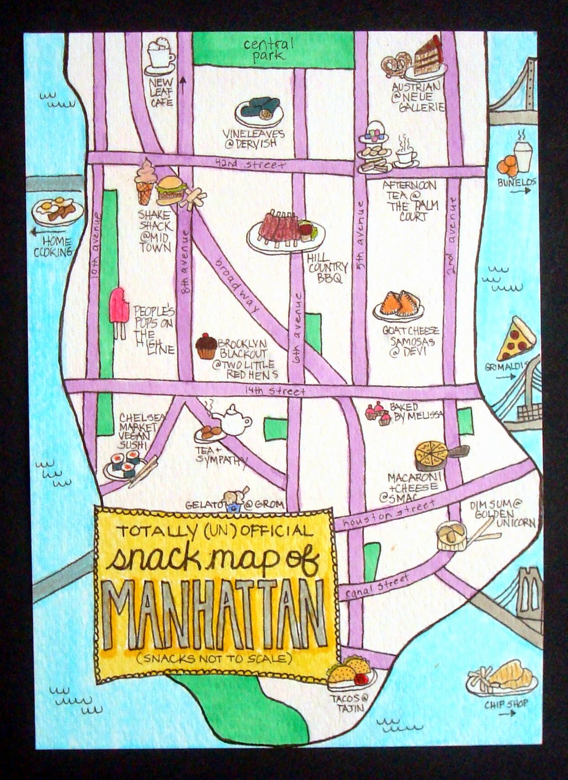
i very nearly didn't do this one. or at least, i was planning to make a collage. because as much as i looooooooooooove hand-drawn maps, one thing i knew for sure when i sat down is that i couldn't draw one. until i did!!! ok, yeah, i'm never going to win any prizes for realism or steadiness of hand. but it turns out i really ♥LOVE♥ drawing, and i really love this, my officially unofficial snack map of manhattan!* (and yes, for the record, these are all real snacks available at the named venues which are more or less where i've placed them in lower manhattan!)


something hitherto unsuspected that i learned the summer before last, via ICAD: i can draw mandalas and i really enjoy it! who knew?

*coming next week: the sweets of san francisco!!! :) (just kidding!) (ok, i was kidding, but we did have some AWESOME food there, too. hmmmmmmmmm...)

Friday, August 22, 2014

it is a truth, universally acknowledged...

...that the cards we love most are always the hardest ones to photograph. a fact i shall be happy to prove in a moment; but first, allow me remind you that this fortnight's card prompt at ♥JINGLE BELLES♥ is called "the hanukkah song"* and the brief is to make cards for our friends and relatives who don't necessarily celebrate christmas. despite the title, you're not limited to hanukkah however; ANY of the "other" (aka non-christmas) winter holidays will work: kwanzaa, new year, hogmanay, solstice... OR... you can go completely non-denominational and make a general winter-themed card.

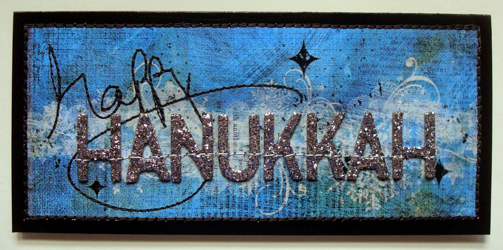
i went with hanukkah this time, and built my card around a grungy, layery, digital collage i made in photoshop and printed on an inkjet transparency. that's where the photo troubles began. because of course anything reflective is almost impossible to photograph in sufficient light. which essplains why the background of picture has such a grey cast. sigh. but the card's pretty cool anyway, i think:

(digital products: trimmed down grungy blue background paper from kathryn wilson's "inner artist" set; handwritten "happy" overlay from anna aspnes' "retro holiday" art play palette; see-through snowflakes brushes by rhonna farrer; grungy lace brushes #1 by katie pertiet, designer digitals; real-life products: white texty patterned paper: basic grey; chunky silver glitter thickers: american crafts; glossy black cardstock: paper accents; ink: stewart superior; adhesives: staples brand gluetape runner, sewing machine)

you may not have noticed right away-- at least i kind of hope you didn't-- but there were NO official hanukkah-themed products involved in the making of this card. i used hanukkah colors (blue, white and silver) and sparkly letters to spell out the sentiment, and that's all; but i think it gets the message across. the letters are glitter-encrusted chipboard and the "happy" has been machine stitched to add a little texture. because even though i love and appreciate CAS cards, rather to my chagrin, i am physically unable to make them. here's a shot that shows the detail a little better. the operative words here being "a little":


be sure to hop over to ♥JINGLE BELLES♥ to check out Stephanie's gorgeous (and wonderfully photographed!) card and upload your own masterpiece!

*in tribute to the awesomely eponymous ditty by the great bard adam sandler! :)

Thursday, August 21, 2014

lettering and other stuff

my doodling + watercolor obsession has morphed... in the way these things do tend to morph... into a doodling + watercoloring (or markering) (yes, that is too a word!) my own fonts. ok, well, technically a few of them are my own fonts, whilst the others i've seen online and tried to copy. my favorite letterers (ok, i'm not sure that one is a word, actually, but you know what i mean) so far are pam garrison, joanne sharpe, julie balzer and martha lever, not to mention daisy yellow's creator, miss tammy! but there are sooooooooo many awesome examples out in the world, i want to try them all and then make them into my own thing!!! meanwhile, here's the latest batch of daily paper prompts, some of which feature... wait for iiiiiiiiiiit... LETTERING! :)


i'm getting more confident with shapes, i've started to play with patterns and of course i've always loved color. my biggest issue is SPACING. see the two S's at the end of success? yeah. for that matter, all of the doodles and arrows were added at the end to fill/balance my spatial issues, but i think i did an ok job of it, actually. oh yeah, and everything leans just slightly to the left, but that's an easy fix, i think i just need to pencil in center lines to keep me on track.


this prompt was devised and hosted by gretchen miller, whose blog, creativity in motion is quite seriously awesome. i definitely feel like i strayed away from the dictionary page being the focus; but since this is an example of my favorite way to work whilst journaling... basically to just keep DOING STUFF and see where it ends up... i'm fine with that, in fact i'm happy about it. 


ok, i confess, after a couple of late-night tries i realized that i had NO IDEA at all how to draw a chandelier, so rather than give up, i totally cheated and found one online that i liked and copied it. the left half took me about 10 minutes to sketch out; the mirror-image right half took like 40 minutes! symmetry is HARD, people!!! (and yeah, even more than my lettering-- or even my politics-- my drawings all lean to the left!!!) 


i already had a stand-by set of supplies that i keep in a little plastic schoolbox type thing for doing travel journals, but for this i made a second version in hopes it will encourage me to go out and sketch. watercolor tablet, travel set of paints, and the brush-wrap i made myself from a remnant of oilcloth when i couldn't find one at the art supply store. (my friend lelia gave me the cool ganesh mini-tote a couple of years ago, and it's the PERFECT size for this!)


i love the lettering on this (she said modestly!) and it's even STRAIGHT! i'm not uber-keen on the rest. especially since those magazine lips are sooooooooooooo awesome and i feel like i didn't do them justice. ah well. i do love the lettering, though. :)


this prompt was devised and hosted by patricia dattoma, whose examples are astonishing, you really need to click that link; and it was sooooooooooo totally ♥FUN♥ to do!

meanwhile, the lettering craze means i'm deeply in need of some short quotes or catch phrases on which to practice, so if you have a favorite quote OR quote site, leave me a link in the comments, k?! thanks, quotable darlings! ♥

Tuesday, August 19, 2014

chip off the old block

this week at shopping our stash the challenge is called "chipping away" and the assignment is to use some of that long-neglected chipboard that i just know you have sitting around in various boxes and bags! don't worry, i still have quite a bit, too, especially leftover 6x6 sets; and every time i break into it, i remember how much i love it. but let me show the card (which was commissioned by my aunt for her friends' 50th wedding anniversary!) first and explain it afterwards. please excuse the pics, pretty much every single thing on the card is reflective in some way, making it a serious challenge to photograph. in real life the gold is not as shrill and harsh-looking, i promise; it's actually quite elegant!

(naked chipboard frame by fancy pants: i painted it white and adorned it with bits of a vintage gold foil doily, see photo below; patterned paper: mambi, pink paislee, chatterbox, recollections; florals: prima; brads: my mind's eye; rhinestone flourishes: recollections; adhesives: staples brand gluetape runner, 3m foam tape, scotch brand gluestick, scotch tape, sewing machine)

ok, so where's the chipboard? it's the frame, which is approximately 5x5" and was completely unadorned when i started. i painted it white, and glued bits of a vintage gold foil doily on top, to make a sort of filigree effect. it was a bit fussy to do, but i love the way it turned out!


the other "fussy bit" of this card is the heart, for which i hand wove strips of paper into a big enough area from which to trace and cut another chipboard shape. that process looked a bit like this:


not that you need to see it, but by golly it was a production... a fact which is very much not apparent from the finished card (especially to civilians!) so i'm determined to show SOMEONE, lol! :) in case you're wondering, by far the best way to get a finished bit of paper weaving to stay woven is loads of scotch tape on the back before you cut out your shape. of course, the little cut ends will still want to curl up on the front, so after i tacked the woven heart to some ivory cardstock i machine stitched around the edge to hold those babies down. there's also a little bit of lace on the panels beneath the framed heart, which i wrapped around to the back and taped in place. i probably didn't need to sew around the edges, but i think it adds to the overall design, so i did anyway. here's the card again, for reference:


and now i suggest a visit to SOS to view the gorgeous work of my lovely design team mates and start planning your own chipboard-bedecked masterpiece! ciao, darlings! ♥

Friday, August 15, 2014

warm winter wishes

this fortnight's card prompt at ♥JINGLE BELLES♥ is called "the hanukkah song"* and the brief is to make cards for our friends and relatives who don't necessarily celebrate christmas. despite the title, you're not limited to hanukkah however; ANY of the "other" (aka non-christmas) winter holidays will work: kwanzaa, new year, hogmanay, solstice... OR... you can go completely non-denominational and make a general winter-themed card. that's what i did:

(digital products: vintage findings papers by jen allyson, design house digital; vintage christmas blendables #2 and text clusters #3 by katie pertiet, designer digitals; brushes from anna aspnes' "retro holiday" art play palette... collage printed on an inkjet transparency; real-life products: white texty patterned paper, green snowy paper and cardstock alphabet stickers: basic grey; other paper scraps: daisy d's, studio calico, crate paper; chunky white glitter thickers: american crafts; silver flowers and white felt snowflake: michaels; brad: my mind's eye; ink: stewart superior and colorbox chalk inks; adhesives: staples brand gluetape runner, 3m foam tape, sewing machine)

i know i've said this before, but in my opinion it's still true: the old school basic grey cardstock alphabet stickers are some of the coolest ones ever made! here i've combined them with chunky (and glittery!) chipboard letters to make a sentiment to be the focal point of the card. the background is a digital collage i made in photoshop some time ago. it was actually the label i used to mail my holiday packages last year; when i saw it again recently, i thought it would make a nice base for a card, and i stand by that decision! a few border-punched cardstock strips, a silver flower and lots of machine stitching round out the design.

be sure to hop over to ♥JINGLE BELLES♥ to check out Stephanie's gorgeous card and start planning your own!

*in tribute to the awesomely eponymous ditty by the great bard adam sandler! :)

Thursday, August 14, 2014

is it possible to become addicted to watercolors?

not that i mind, actually; or that i want any help to quit, for that matter. but i do seem to be totally hooked on painting pretty much everything at the moment, and even treated myself to a couple of new brushes at michaels the other day. here are some daily paper prompts i made with them:


every time i make something intricate with a lot of stitching, jeff always flips it over to look at the seemingly "free form" sewn pattern on the back. sometimes he even says, "i think you should post THIS side!" which got me thinking: what if i took a magazine photo or drawing and outlined the entire thing with machine stitching, but then turned it on the other side and... what? colored it with markers? no wait... how about paints? this was my first attempt. below is the front side showing the original artwork, i think it's an erte drawing from the 30's; i liked that it had really strong lines but not too much fussy detail.


the brief here was to do three different varieties, so i chose to use the same colors, but vary the scale, the outlines, and the way i applied the paint. 


this one's pretty simple, but i like the colors and the way the circles intersect. (i made them by outlining the inside and outside of a roll of tape!)


the assignment was to make a grid of paint or marker colors, but i had my box of deco tape sitting in front of me and my plan to make a black and white tape grid in which the painted colors would live got out of hand. my favorite parts are the variety of different grids stitched on top of the tapes, especially the diagonal.


having fallen in love with this journal page by birgit koopsen, i decided to see if i could recreate the beautiful, large, deeply pigmented, blendy droplets by using distress reinkers and a spray mister. ummmmm... NOPE! not even close!!! back to the drawing board, lol! :)

Tuesday, August 12, 2014

back in the day

this week at shopping our stash you've got a choice as to how you approach our theme. it's called "old fashioned" and you can choose to use images that evoke history (horse and carriage, vintage typewriter, antique box camera, a couple in 1920's clothing, etc) OR you can use a tool or technique that has somewhat evolved out of style... such as setting eyelets with a hammer and punch, or using a coluzzle (remember that?!) or other old-skool template to trace and cut shapes. there are only two rules: if you assay the first choice, you can't just do a general "shabby chic" style, there has to be something visibly antique on display; and if you choose option two, you have to tell us what "old fangled" technique you've used. i went with the first option, and here's how it came out:

(vintage map and antique images cut from old, falling-apart books; patterned paper: basic grey; black glossy cardstock: paper accents; adhesives: staples brand gluetape runner, 3m foam tape, xyron, sewing machine)

i have to confess that i'm not absolutely in love with this, but it a) fits the brief and b) features an antique car and vintage map that our chiropractor (whose birthday card this is*) will love. and c) it's DONE, which is pretty awesome, too, so i'm goin' with it!

hop on over to SOS to see what the rest of the gang has created, and be inspired to devise your very own old fashioned masterpiece! ♥

*what? you don't celebrate your chiropractor's birthday? really??! ok, this is one of those things that either already makes total sense to you or i could not possibly explain well enough to convey. jeff and i both have chronic back issues and have seen the same guy for like 20 years; at this point he's pretty much a member of our extended family. so yeah, once a year, i make a bit of a fuss. :)

Sunday, August 10, 2014

collage ahoy!

in case you were wondering when bits of randomly combined paper were going to make their appearance in my daily paper prompt collection, the answer is, "NOW"! :)


possibly my favorite kind of collage to make is the "more fun than cleaning up all these tiny scraps" variety, where i really do just grab every miscellaneous thing within reach and try to combine it. sometimes that results in a real mishmash, but this one came out pretty well, actually. (please note that i twisted this prompt for my own purposes!)


more papers from my dripping and blotting essperiments last week. i didn't really love any of them in their native state, but punched and stacked and sewn together they become a bit more than the sum of their parts. (...and clearly this summer's mini-obsession with circles is not over yet...)


some nights when i sit down at 9pm with no ideas at all the process of "powering through" results in something fresh and new and awesome. this was not one of those nights, lol. but i practiced hand-lettering (and numbering) and tried every color of paint in my new travel watercolor set, so WAHEY!

Friday, August 8, 2014

the shape of things to come

we're still celebrating cards that are not square or rectangular at ♥JINGLE BELLES♥ and we'd love for you to join us. i realize it's only august, but you know as well as i do that as soon as the kids go back to school in september, it's a fast downhill shlalom to halloween; and then fifteen seconds after that it'll be the december first. so the more cards we make now, the less that will be lurking around to bite us in the... (AHEM!) ...proverbial during the holiday season. plus, shaped cards are *FUN* aren't they?! thus, the world needs more of them! i realized the other day that i had not made any round cards yet this year. how is that even possible?! well, never mind, i've made one now, and it's kinda cool, i think. but you tell me:

(patterned papers: tim holtz, crafty secrets, making memories; glitter paper: doodlebug; sentiment sticker: hambly; doily sticker: echo park; brad and backer: my mind's eye; 1" circle punch: ek success; poinsettia and glittery gold leaves: michaels; ink: colorbox; adhesives: staples brand gluetape runner, sewing machine)

i used CASE study #202 as my inspiration, and you can see i liked the kraft patterned paper, the bold flower and the horizontal sentiment, specifically. the challenge ended earlier this week, but it's still worth a look since both the DT and readers' gallery cards are fab!


hop on over to ♥JINGLE BELLES♥ where you still have nearly a whole week left to link your own gorgeous creation on the shape-up post!

Thursday, August 7, 2014

starburst tangent

tammy has started a fab new series on the daisy yellow blog, called tangents and tactics. they're sort of amped up journaling prompts. in addition to giving you an idea and some examples of how it might be interpreted, she's provided a bit more specific/step-by-step information about method and materials, and even a little video! just another way to make it easy and fun to dip a toe into the art journaling arena. the first tangent is a starburst, and if you make one, there's a starburst tangent link love to display yours and leave some admiration for the creations of others. meanwhile, here's mine: 


speaking of tammy, she's written a very cool thing about daily art practice, in this post; my favorite part is the bit in smaller typeface, set off by "disclaimer". not to give it all away, but she makes the distinction between creating a journal full of beautiful finished pieces of art and making time for playing and experimenting and embracing new things. don't get me wrong, it's fabulous that there are soooooo many gorgeous inspirational sites and books and pages to be found online; but the less awesome flipside of that is (i think of it as "the pinterest effect") we can sometimes psych ourselves out, and start thinking things have to be perfect to be shared, or maybe even to be worth doing in the first place! and to me that feels so antithetical to a creative life.

ok, so, having explored the "TANGENT" concept in every conceivable sense, lol, i'm now gonna go make something pointless and crazy, just because i can! how about you?! (say yes, say YES, darlings!) ♥♥♥

Wednesday, August 6, 2014

more painty, stitchy, flowery goodness

i'm still following along with the daily paper prompt on the daisy yellow blog, and so far there isn't a collage in sight. trust me, i'm as shocked about this as anyone... probably MORE! i'm sure i'll be back to my regularly scheduled "gluing pieces of paper to other pieces of paper" routine any minute, but right now it's all-media, all the time, so i'm just goin' with it! :)


ok, technically, this particular exercise didn't quite come out the way i thought: i scribbled concentric circles of water soluble wax crayons and then sprayed the heck out of them with my plant mister. i thought they'd get runny and drippy, which they did... but because i'd filled the whole page with color there was nowhere for it all to drip TO... so it just sort of ran into the sink. but it looked cool anyway, so i just kept going and added loads of stitching.


still loving alisa burke, my watercolors, and practicing blending. as you can see. kind of psyched when lovely husband jeff asked me if i'd make this into his mom's birthday card. 
(i said yes, obviously!)


even more watercolors! this was sooooooooooo much fun to make, i can't even tell you. which is somewhat hilarious because the idea of making something with only straight lines totally flummoxed me for most of the day. then i stopped thinking and sat down with a pen. problem solved!


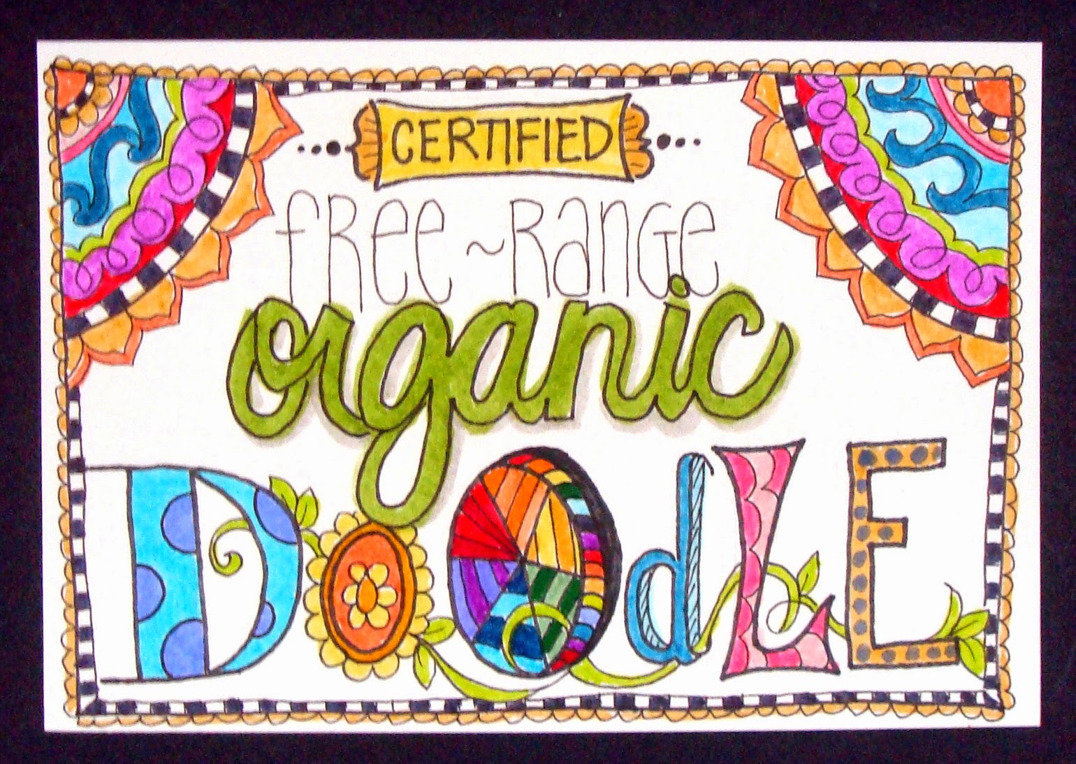
another prompt which had me scratching my head and thinking i might go freestyle for the day; until i got to the very last line of tammy's post which said, "long live free-range organic doodling!" well, YEAH!!!!! 

♥♥♥
long live free-range organic whatever-creative-thing you feel like doing today, darlings!
(though, as a matter of fact, i do actually highly recommend doodling!)
♥♥♥

Tuesday, August 5, 2014

"i ♥LOVE♥ this one!" she said, modestly

ok, yeah, i realize that's not very humble. but i also know that everyone reading this has had the experience of sitting down to make something with a very clear picture of how the finished project ought to look, and being pretty darned happy if the actual item comes anywhere even close to that. but every once in a while, if we're very, very lucky, we actually produce THE EXACT RESULT we wanted, and this is one of those times. so yeah... i'm obnoxiously happy! :)

(patterned paper scraps: basic grey, prima, my mind's eye, making memories, bo bunny, studio calico, crafter's secret ... plus... dictionary and book index paper; vellum: the paper co; pearl flourish: prima; watercolor paint: grumbacher, koi, loew-cornell; spray inks: tattered angels, mister huey, radiant rain; water soluble wax crayons: reeves; circle punch: ek success; adhesives: staples brand gluetape runner, xyron, scotch brand gluestick, sewing machine)

i probably should have mentioned that this week's challenge at shopping our stash is called "splish splash" and the brief is to use some sort of wet media-- spray ink, watercolor, acrylic paint, india ink, water soluble crayons, etc etc-- in any way at all; either as a background, or with stamps as a focal point, or maybe even just on their own? perfect idea for a hot summer's day, when you can go out in the backyard and make as big a mess as you want, am i right?

i used a few different wet media products on this: the sky and grass background is a combination of watercolor paints and spray inks that i brushed on, sprayed on, eye-droppered and blotted until i got the result i wanted. the heart is every color of red and pink water soluble wax crayon i own, brushed and blended together, then cut out. there's some scrappy goodness here, as well: a dictionary page house, topped with a roof composed of punched circles from leftover bits of tan and brown patterned papers; swirly white vellum clouds and part of a pearl flourish. i considered adding the sentiment, "home is where the heart is" but i ran out of room, so it's inside the card, instead.


be sure to check out the other designer projects at SOS; then get splishy... and/or splashy... and link up something fantabulous of your own, darlings! ♥

Sunday, August 3, 2014

hello, august!

i know for a fact that every day, week and month of the year consistently and unwaveringly takes up exactly the same amount of time as every other day, week and month of this (or any) year. having said that, july positively flew by at light speed, didn't it?! with the coming of august, we've transitioned out of the index card a day project and embarked on an equally cool tradition on the daisy yellow art blog, namely the daily paper prompt, in which miss tammy will give us a suggestion for something we can do each day to keep up our art journaling habit!

after 61 consecutive days working on 3x5" index cards, it's awesome to have the freedom to work at any size or shape that takes my fancy. on the other hand, in some ways, more choices can be overwhelming. i'm trying to stay loose, work fast, and not get bogged down in decision-making. i want to stay process- rather than outcome-based. having said that, i really like how day one came out, and it must be said that having a really cool first page in any new journal or collection is pretty motivating! :)


i scribbled water soluble wax crayons in the order of the spectrum, and blended them with a really really wet paintbrush to make them run. then i added some hearts diecut from rainbow colored scraps. in retrospect, i realize this would look better with the stitching horizontal rather than vertical, which is AWESOME... i'm so glad i did the experimental thing instead of tried-and-true!!!


ok, you caught me, there's nothing fast or loose about this one; it became a full-on graphic design extravaganza. you can't say it isn't experimental, though, because for me minimalism is the ultimate challenge. another smudgy rainbow, seen through a cloud-punched piece of white woodgrain cardstock, mounted on grey patterned paper. and for the record, NO, not every single dpp is going to have a rainbow. at least... i don't think so... hmmmmm...

oh yeah, i almost forgot AGAIN to thank everyone for the awesome comments about my new header! midway through ICAD i thought it'd be fun to have a photo of all my cards sprawled out on the table. i liked it so much, i decided it should be my header for the rest of the summer. it's by far the simplest one i've ever made: just the photo with text on top. the fab grungy font was free from dafont.com and is called 4990810; i made it look sparkly using a photoshop layer style called "over the rainbow glitters" by studio flergs from sweet shoppe designs. easy, peasy! ♥