Sunday, July 31, 2016

narwhals, narwhals, swimmin' in the ocean, causin' a commotion, 'cause they are so AWESOME!

i know some people sing hymns on sunday, but the narwhal song is good, too... and somewhat more pertinent as an introduction to this week's index-card-a-day output:

card 54: aquarium
here's my thought process on this one: "hmmmmm... aquarium... fish, water, coral, seaweed, pebbles, OOOOOH! NARWHAL!" so now you know. :)
(some advice from lovely husband jeff for moments like this, "just go with it")

card 55: olympics
helping out the olympic committee by redesigning the rings logo. not sure they'll have it up and running for the games next week, but i have high hopes for 2018...

card 56: text or texture
what i thought was a super-fast idea --to stamp a rainbow alphabet using 7 or 8 different letter sets-- actually took longer than any other card in this post, but it was fun, at least!

card 57: stickers
the infamous $4 pack of vellum stickers from target makes a triumphant return to a mandala near you!

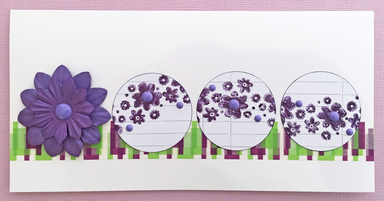
card 58 (a, b and c): off prompt
when card 57 didn't quite finish off the set, i decided to make "one more card" using the rest of the stickers. turns out, it took three more cards. you can't say you don't get value for money at target, eh?

card 59: tic tac toe or hopscotch
i chose the former, and yeah, it's a looooooooooooooose translation, but i had a blast playing with stencils and ink and pens and... well, it was fun!

 card 60: sorbet
once again, more a case of "inspired by" the prompt than a real interpretation of it. but that's why they're called "prompts" and not, "assigments you must take literally, and YES, we mean you, lauren" right?

card 61: graffiti (out of order)
i deliberately saved this one 'til last because i thought it'd be the perfect vehicle with which to say a ginormous THANK YOU to tammy garcia, to my fellow ICADians, and to all the commenters, cheerleaders and bestowers of little hearts via social media; you have all helped to make this my happiest ICAD ever and i am very grateful! 
♥♥♥♥♥ 

and finally, the shot i've waited 61 days to take: the official sprawly ICAD2016, book chock full of this year's colorful, crazy, fun cards. can i get a, "WOOHOO" darlings?!


hope life is treating you well this summer sunday morning, and that your very first week of august will be full of ♥AWESOMENESS♥!

Friday, July 29, 2016

we three kings...

...which, in this case, are xmas trees! lemme essplain: this fortnight at ♥JINGLE BELLES♥ we're celebrating christmas, cubed, with a little prompt we like to call, "we three kings" for which we want to see holiday cards with three of... SOMETHING. i chose three tiny trees cut from three tiny scraps of patterned paper. a bit like this:

patterned paper: pebbles, graphic 45, sweetwater, a bit of petaloo flower packaging and some vintage sheet music; white kromekote cardstock: the paper cut; snowflake stickers: american crafts; ink: colorbox; adhesives: elmers brand gluetape, 3m foam tape

once i had my sweet little trees ready to inhabit a card, i wasn't quite sure what else to do, but luckily the day was saved when i saw week #422 at sketch saturday:


if you need additional inspiration, why not check out stephanie's card at ♥JINGLE BELLES♥? 

Thursday, July 28, 2016

aloha, summer!

i was pretty excited that my double rainbow card was one of the top picks in the retro rubber blog's "brads and eyelets" challenge, and even more psyched to find out that their new prompt is "summertime"... which is one of my go-to card themes, so i had to play along. here's what i made, it features two of my all-time favorite eyelet outlet items, tall palm tree brads and sun and cloud brads:

one year-old alphabet stamp set: "lili" by freckled fawn (alas, no longer available); brads: eyelet outlet; ancient and beloved pink sparkly flamingo sticker: meri meri; patterned paper: my mind's eye, american crafts; white kromekote card stock: the paper cut; adhesives: elmers brand gluetape, 3m foam tape, sewing machine

my "retro rubber" in this case is my all-time favorite set of alphabet stamps, it's called "lili", i got it from freckled fawn as part of a little birthday treat/shopping binge last june. (making it only just eligible for the challenge, who ask us to use something at least a year old!) i'm really glad i splurged on it at the time, because not only do i use it constantly, but when i went back to try and find it again for someone who asked about it just a few weeks later, it was already out of stock and i've never seen it again anywhere.


i'm linking up at the atlantic hearts sketch challenge for the first time, having used this corker (#170) of a sketch:


and just a little reminder that the machine stitched border on this would qualify me (were i not a dt member, lol) to enter our "a stitch in time" challenge at shopping our stash, which will be open until next monday night, woohoo! ♥

Tuesday, July 26, 2016

SOS262: a stitch in time

this week's challenge at shopping our stash is pretty straight forward: we want to keep you in stiches! or rather, we want you to keep US in stitches. or at least, we want to see papercrafting projects which feature stitching. it can be hand embroidery, machine sewing, or even the ever popular faux stitching. here's what i made:

arguably the best project EVER for using up old-school paper flowers and leaves since you can combine just about any and every size, shape, color, texture, etc and get a completely different look every single time. in this case we've got a bunch of old school primas, a few bargain brand pink ones, a giant petaloo centerpiece, and a bunch of recollections and prima leaves; brad: recollections; cardstock: sei and doodlebug; adhesives: elmers gluetape (used sparingly to "tack" things down before sewing; 3m foam tape (to raise the center flower stack up a bit) and of course my valiant sewing machine, kenneth kenmore, loaded up with coats and clark heavy duty upholstery thread in white, set on the lowest stitches-per-inch setting so they really show up!

ok, yes, everybody knows i looooooove to sew on cards. i sew as a design element, and sometimes also for security, because there's nothing more depressing than a card that arrives at its destination minus its beautiful floral focal-point; or with a few of its chipboard letters laying at the bottom of the envelope. in this case, the sewing is almost entirely decorative, but i really think it adds to the mandala design. speaking of which... *HOW* is it possible that i've been "into" mandalas for at least five years, i've made punched ones, monsta ones and giant decor ones; i've even got an entire pinboard called "many mandalas" which contains examples in every conceivable media... and i've never thought to make one out of the gazzillion old-school, flat paper flowers i still have from the days when those things were an absolutely *REVOLUTIONARY* embellishment in terms of 3-dimensional coolness?? well, not to worry, i'm pretty sure i'll be making up for lost time now!


need some other ideas for incorporating stitches into your next project? check out the splendid work of the SOS dt, whose motto is, "sew far, sew good"! ♥

Monday, July 25, 2016

A Banner Day

It's my turn on the Eyelet Outlet Blog once again, where i make a shocking true confession: I have a serious obsession with washi tape... and no intention at all of doing anything about it... except enlarging my collection and making more washi-adorned craft items. Luckily, Eyelet Outlet is here to help me in this quest. Have you seen how many different varieties of tape they stock?? It's a washi-lover's dream! Here's a card that uses two of them: Pink Flower Washi and Foil Pink Dots Tape.


Did you know Eyelet Outlet has ribbon, as well? This Fruit Ribbon is one of my all-time faves. It's so summery, don't you think? But there's nothing quite as summery as a Flamingo Flatback Resin, so I had to add one of those to my card, too. It's nestled on a few Solid Color Paper Flowers, just to be cozy.


Do you love cards with banners as much as I do? There are loads of ways to make them, but imo, washi tape is hard to beat, since you can fold it right over a piece of twine and it's self adhesive! I've used the Pink Flower Washi again in just that way on this card, as well as a few happy little clouds cut from a Cloud Tape that is, alas, out of stock in the online store... but provides you with another reason to always check the Eyelet Outlet booth at your next trade show, because there are sometimes exclusive goodies! ;)


Of course with all these wonderful new products we sometimes lose track of the fact that Eyelet Outlet's first name is EYELET... and those things are still as much fun to use as the very first time I saw them being set (with a hammer!) at my LSS, years ago. I've used the good old 5mm Round Assorted Colors Pack to secure the twine between my pennants as well as to dot the "I" in "Hi".


I hope you're already having a "Banner Day" but if not, there's still time to make some cards, which will definitely cheer you up! ♥

Sunday, July 24, 2016

it's the last week of JULY, people!!!

and whereas the time spent doing ICAD absolutely always flies by much more quickly than ordinary time, this year seems to be moving especially fast. of course, it's been especially fun, too, so i really have no right to whine! in fact, i think i'll post some index cards, instead:

card 47: monochromatic
as far as i'm concerned, there's only one color to have when you're only having one color... and that's HOT PINK! (obviously.) in this case, hot pink stickers, with hot pink outlining, on a hot pink background. 

card 48: aurora borealis or australis

i don't have many rules in ICAD (or life, for that matter, lol) ...except... since this is supposed to be about creative spontaneity, i tend to feel "no do-overs" is a really good policy. but even a self-imposed rule isn't really a rule until you've broken it, so i did. :) 
(even having tried several versions, however, i still don't feel like i really "cracked it" in terms of producing something that either somewhat resembled the aurora borealis OR something i really liked; but it was different and fun and a great excuse to mess around with paints all evening, so i'm ok with that.)

card 49: off-prompt
a conversation in the ICAD facebook group reminded me that it'd been aaaaaaaaaaaaages since i'd made a one staple collage. which is obviously unacceptable.

card 50: paisley
yep. that's paisley, all right.

card 51: purple or violet
a card that went back to the "no do-overs" rule and kicked its butt. b/c this is NOT what i envisioned when i sat down with a few lovely shades of color burst to watercolor some hand-drawn letters... but i just kept going and let it evolve, and i'm really glad i did!

card 52: staircase
inspired by the actual spiral staircase in my home... but in the style of m.c. escher... with colors chosen by hello kitty...

card 53: fortune
i was totally and completely stumped, until i remembered fortune cookies!!!
(and once again the day is saved... by baked goods...♥)

hope you're having the best sunday of the whole entire week, but if not, there's still time to do something FUN or creative or both! (and if you're in the northeastern united states, i hope you're keeping COOL in this heat!) ♥♥♥

Friday, July 22, 2016

lookin' sketchy

we're still rockin' stephanie's gorgeous sketch over at ♥JINGLE BELLES♥ and you still have plenty of time to join the fun!


my card this week is a slightly looser version of the sketch, but i hope you can still see the bones? i've played with the proportions a bit, and added the pennant mat (which i found in my "scraps" bin and re-fell in love with) but all the basic bits are really there, i promise, plus it's almost entirely red, white and pink... which coincidentally would be the colors of the flag if i ever founded my own country! :)

patterned paper: crate, love elsie/american crafts, we r memory keepers, studio calico; white kromekote: the paper cut; santa face digi from "santa cut outs no 1" by katie pertiet, designer digitals, printed on kodak premium photo paper; journal card: elle's studio; wordfetti stickers: october afternoon; adhesives: elmers brand gluetape, 3m foam tape

hop on over to ♥JINGLE BELLES♥ to see what stephanie has created this week and to check out the gorgeous readers' gallery!

Tuesday, July 19, 2016

SOS261: you are matchless!

are you wondering what this week's challenge at shopping our stash can possibly be? "you are matchless"? because i confess i was curious when i first saw the title on our design team blog. and then a tiny bit nervous when i discovered the brief was to create our own matchbook or matchbox, because i had never done either. it took me a few experimental folds on scrap paper to figure out the engineering, but once i got going, it was really fun! here's what i made, and then i'll explain a bit more:

beachy scene painted using color burst pigment powders mixed with water on strathmore watercolor paper; palm trees stickers: jolee's; hibiscus: sandylion; surfboard cut from a piece of creative imaginations patterned paper; aqua fabric thickers: american crafts; adhesives: elmers brand gluetape, 3m foam tape, sewing machine and staples

i realized pretty quickly that the outer structure of the matchbook needed to be fairly sturdy. i think good quality cardstock-weight paper would do it, but since i had a few painted watercolor papers, i thought one of those might be a good alternate choice-- and i stand by the decision. i was especially happy when i found a large piece that i'd started painting with color burst in a sort of beachy color scheme, but then abandoned for some reason. the positioning of the colors was just right for the matchbook folds and big enough that i could make a finished (folded) card that measures about 4.5x6". when i realized i needed to trim down the "sand" section, it occurred to me i didn't have to snip it straight across, as long as i left the middle bit wide enough to still hold the matchbook closed.


i thought about painting some customized embellies, too, but i was kind of worried i'd mess the thing up in the engineering stage, so i decided to go with my sturdiest store-bought palm tree stickers, and some fabric-covered chipboard alphas for the sentiment. as you know, i like to sew over my chipboard letters for extra security, but i used a sort of wavy pattern to add a little interest.


ordinarily i leave the inside of my cards plain, but this piece of watercolor paper had some doodles and markings on the back, so before i began, i xyroned an islandy bit of map paper to the reverse. meanwhile the palm trees and flowers on the left... and surfboard on the right... hide the two staples which hold the flap in place that acts as "latch" to keep the matchbook cover closed.


need some more "matchless" inspiration to spark your interest? the SOS gals have plenty of that... head on over and check it out! ♥

Sunday, July 17, 2016

paints and inks and pens, oh my!

art supplies are awesome. fact. they're fun to shop for, fun to bring home, fun to look at and ESPECIALLY... they're fun to play with, ANY way you want! i hope you got to spend some quality time with your art supplies this week, but if not, try to squeeze a little art into today, k? even if it's just on an index card, like these:

card 40: surfboard
i know what you're thinking, you're thinking, "hey lauren! why is this called 'surfboard' when there's absolutely no surfboard in this (admittedly kinda cool) little color burst watercolor?" well, just look waaaaaaaaaaaaaaaaaaaaaaaaaay out into the ocean and maybe you will see it!
(ok, fine, yes, you've caught me, i got so involved in painting the beach, the ocean and the palm tree that i forgot the prompt was "surfboard"!!! sometimes it's very tiring to be me, lol!)

card 41: longitude and latitude
when i'm really stumped for an idea, i either jump waaaay out of the box, or climb in to its deepest depth. this is the latter. i googled latitude and longitude and got the numbers for our town, which clearly was of no use at all for making an ICAD... or... hey waittaminnit!!!

card 42: yellow
another idea for when you have no ideas: grab a random selection of stencils and one color of art supplies; keep adding layers until you like what you see or run out of time before bed, whichever comes first.

card 43: mint
feel free to use my color burst painting of mint leaves in your color burst painting of a mojito!!! :)

card 44: rainbow making machine
arguably the BEST PROMPT EVER, which is really saying something, since tammy garcia is awfully good at thinking up themes!!!
(ps: i'm happy with my "masheen" though the proud auntie in me feels i must tell you that my niece jillian drew the most amazing cannon with a very fancy control panel which shoots segments of rainbow and it's one of the coolest things i've ever seen in my life!!!!!)

card 45: play on words
i freely confess that i totally copied this, my all-time favorite visual pun, from an artist called jason bergsieker whose original was featured on i can has cheezeburger several years ago, and that it still makes me laugh really hard every time i see it!

card 46: off prompt
yet another idea for when you have no ideas: have a "default drawing" subject. pick something you never get tired of, and just keep doing different versions of it. mine-- as you know-- is the mandala. for this one i laid down the ink first (using sponge applicators), then drew in the lines, then added detail and shading with colored pens. 

i hope you're having a fabulous weekend, but if not, you're quite possibly the only person in the world looking forward to monday, so take a few minutes to revel in the uniqueness of that, won't you?! ♥♥♥

Friday, July 15, 2016

merry sketchmas to you

i love sketches for card-making, i may have mentioned that before-- possibly even several million times before, lol. i especially love sketches drawn by my lovely friend and ♥JINGLE BELLES♥ cohort Stephanie Severin, so i'm pretty psyched that we have a brand new one this fortnight:


is that fabulous or what? totally flexible, but with enough specific shapes to make one start thinking of specific stash items. for example, when i first looked at this, i thought, "ribbon, doily, postcard, flower!" i got everything right except the ribbon, which i swapped out for a punched paper strip. oh and i rotated the sketch ninety degrees clockwise, when the vintage postcard i wanted to use turned out to be tall instead of wide:

scan of a vintage postcard from my collection, reduced slightly and printed on kodak premium glossy photo paper; german scrap flower and doily from my stash; patterned paper: pink paislee, dcwv; gold cardstock: the paper co; florals: prima; border punch: recollections; ink: colorbox; adhesives: elmers brand gluetape, 3m foam tape, gluedots, sewing machine

want to see another fabulous take, this time from the sketch mistress herself? head on over to ♥JINGLE BELLES♥ where you can also link up your card and see what others are making!

Wednesday, July 13, 2016

A Bit of Spin Control....

...going on at the Eyelet Outlet Blog today. The crafty kind, though, which is much more fun, than election-based hijinks, am I right? so let's see some examples that pertain to cardmaking:


Here I've used three 2" circles punched from vintage sheet music to make a canvas for a cluster of beautiful Eyelet Outlet Stitched Fall Flower Brads and coordinating Mini Flower Brads (I love that these come in more than one size, and a few different colorways!) I've added a diecut sentiment and some messy machine stitching to frame up the collage, and emphasize the stitched detail on the brads.


Another way I love to use circles is in a line or on a grid. This works great with inchies, though in this case I've used a slightly large size to match the medium and small sizes of Purple Paper Flowers I've swapped out for a fourth circle. I've added several sizes of Purple Enamel Dots to the paper flowers and the stamped flowers on my punched circles, to tie them all together.


A few layered strips of Purple Stripe Washi emphasize the strong horizontal line, too; plus they make it really easy to line everything up perfectly! For the record, I had only ONE strip of washi in my original design, but when I saw the offcuts layered on top of each other at the edge of my work table, I thought they looked really cool! :)


What's you're "go to" technique for designing with circles? Tell me in the comments, or better yet, leave me a link, darlings! ♥

Tuesday, July 12, 2016

SOS260: get inspired by your bedding!

i love inspiration challenges with a twist, don't you? we've got a great one this week at shopping our stash: we're getting inspired by bedding! now, my bedroom-- and bedding-- is nearly all white, and whereas i think i could still make something awesome based on it, i confess that when i read this challenge my first thought went to some vintage linens i was given recently, that i'm planning to use in our guest room:


you can see there are a few different sets, but they're all florals, and they all remind me of my 1970's childhood. in fact, i think as a kid i had sheets (or possibly a bedspread?) very similar to the pink print on the left in this picture, so that's the one on which i decided to base my card:

patterned paper: k and co, teresa collins; tiny alphas: fancy pants; paper flowers: prima; daisies: martha stewart crafts; flower brads: oriental trading; multi-size pearl bling: eyelet outlet; adhesives: elmers brand gluetape, 3m foamtape

i'm pleased with this as a pretty good take on the inspiration pieces, but it's a nice usage of stash, as well. i've got a base of older patterned paper acquired at last year's paper crafting garage sale at paper anthology*, sentiment cut from another patterned paper that i *think* i bought for one of my youngest niece's toddler birthdays, some dimensional daisies that... ok, honestly, i cannot remember buying at all, and finally some old school prima "got flowers" blossoms from the elizabethan era!!! but... you know what? i really still like ALL of the elements and i think they look well together. so there! :)

need more inspiration? head on over to SOS and see the gloriousness the DT has cooked up just for you, darlings! ♥

*this year's papercrafting garage sale at paper anthology is being held on august 20th. click the link to check out the store's website for details; i *THINK* there are still spots left for sellers, but call elisabeth to be sure! 

Sunday, July 10, 2016

ICAD week 6: with EXTRA color! ♥

because if color is good (and... it is!!!) then it stands to reason that ♥EXTRA COLOR♥ is extra good. obviously. in contrast, something which is not good is if your dishwasher suddenly decides that instead of washing your dishes, it'd be cool to partially dissolve the dishwashing soap powder, use the sprayer function to blast that stuff all over the dishes, then use the heat dry function to bake it onto your (still somewhat dirty) dishes. because if you think, "well it's just SOAP, so it'll be self-cleaning; i'll just soak everything for a bit" let me say that scrubbing the baked on soap crystals off glassware was more difficult than the worst stuck-on-roaster-pan scenario i've ever encountered. on the plus side, when compared to other "dishwashers gone bad" scenarios in which kitchens got flooded and electrical circuits shorted out, i'm feeling VERY lucky. and the rest of the week was fun and full of ICADS, which coincidentally happen to be right here! (what are the odds, lol??!) 

card 33: magic
a loose take on the prompt, with star and flourishes hopefully being a bit wand-like?
 (actually just a great excuse to play with stencils and ink and metallic pens!)

card 34: statue of liberty
another stencil, vintage typewriter, a little hand lettering... yep, that'll work...

card 35: sunflower
i love painting sunflowers! i especially love painting them with colorbursts, then sewing... and sewing... and sewing... on top! 
(plus it's about time SEPIA got a turn in the spotlight, dontcha think?)

card 36: crystal or prism
shocking true confession: i cannot draw a recognizable prism!!! not even with a ruler... not even after a few tries... so please to accept this weirdly shaped carnelian crystal with rune-like markings, made from a combination of painted and sprinkled color burst powders in lieu...

card 37: meditation
i don't meditate, but i do draw mandalas, which is arguably a somewhat related field?
(ps: if you struggle with symmetry and/or hate to measure, gridded cards are awesome!)

card 38: folk art
i was on the verge of going off prompt when i realized there is folk art in EVERY culture, and i needn't stay in the usa; plus i've always wanted to make something that references the "milagros" of mexican folk art!

card 39: lens
i was utterly stumped by this one, to the point where i asked jeff what i should draw! here's the funny thing about that manoeuver: 95% of the time it gets a helpless shrug... but the other 5% results in a slam dunk idea i'd NEVER have thought of. painting the view through the lens of a telescope was definitely a five-percenter. thanks, honey!!! ♥♥♥

and now i'll bid you a fond farewell and send you off into what i hope will be THE BEST SUNDAY of your whole entire week!!! :) but first a question: have you hugged your dishwasher today...??!