Monday, October 31, 2016

♥happy halloween♥

halloween falling on a monday is kind of a mixed blessing, isn't it? because on the one hand... it's MONDAY. but on the other hand: CANDY!!!!!!!!!!!! ♥

i confess that in the past, i have not always made halloween cards, but this year, i'm making up for lost time! so when the lovely and talented amy tsuruta sent me a link to a fab challenge featuring monsters i couldn't resist making just one more halloween card. the only catch was, it's a challenge at addicted to CAS. and we all know that whereas i *LOVE* to see cards with a CAS aesthetic, i am pretty hopeless at making such cards. but i was determined to have a go:

patterned paper: KI memories, from the paleolithic era; large chipboard letters: basic grey; small chipboard letters: american crafts; monster brads, spider brads and purple washi: eyelet outlet; glossy black cardstock: ranger; adhesives: elmers brand gluetape, 3m foam tape

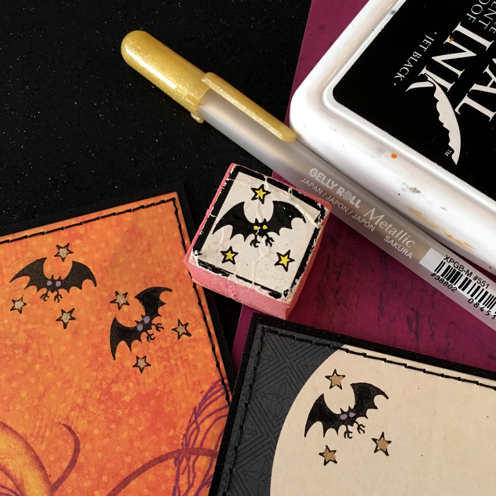
luckily i still had some eyelet outlet monster brads left, which is a considerable advantage in any crafty pursuit; as are mini spider brads and ancient KI memories orange paper. obviously. and yes, i'm still totally addicted to oversized sentiments rendered in chipboard at the moment, so i'm just going with it. arguably, my card could be more CAS... but for me this is downright minimalist (!!!) so again, i'm just going to call it done and be somewhat pleased with my effort.


if you would like to see some cards by people who reallllllly know how to pare down a design to its perfect essentials, be sure to check out addicted to CAS, codeword: monster!

Saturday, October 29, 2016

bring on the stamps, bring out the snark!

i was super-excited to be named the "queen of snark" by the sisterhood of snarky stampers for my pink halloween card (apparently i was the only one who drew a zen-doodle spider web on pink?? go figure!) the prize for such an honor, apart from the obviously enviable bragging rights, is to be their lovely guest star in a future challenge, and mine starts today. the challenge is "W is for WATERCOLOR"!


ok, yeah. i think i can swing that! here's what i made:

water color media: colorburst pigment powders by ken oliver crafts; stamps: script=love to stamp, crackle=cherry pie, leopard=rubber stampede, type=stampin' up, paisley flourish=sassafras lass, music=glitz design, damask=hero arts; ancient jumbo pink glitter letters: making memories; woodgrain patterned paper: pion design; adhesives: elmers brand gluetape, 3m foam tape, gluedots, sookwang tape; tiny brads and epoxy shapes: eyelet outlet

as usual, i had like 37 ideas, and 36 of them were pretty straightforward. so OF COURSE i chucked those immediately and went with the only really weird one, lol.


i decided to make a card full of watercolor flowers, but i wanted them to look almost paper-pieced, so i decided to stamp the different shapes with various pattern and background stamps. i got to use up a lot of the little random bits of watercolor paper that i use at the end of the a watercoloring session to finish off my pre-mixed color burst colors, though, so it was a bit of a stash-buster in that sense. yay!


i cut my floral shapes from scraps of water color paper i had painted with various shades of color burst, then stamped each flower with a different pattern stamp. after inking the edges, adding a few eyelet outlet enamels and teeny brads, and scribbling some little details in pen, i assembled the flowers.


then i used the flowers to adorn my oversized sentiment, "BLOOM". i put some flowers over the letters and some under; i also varied the height of the elements-- some of the pieces have as many as three layers of foam tape to make them stand out!

i'm hopping in on the simon says stamp wednesday challenge, whose theme this week is "anything goes".


my only regret is that whereas i feel very happy with my watercoloring effort and pretty pleased with my stamping technique... alas, i didn't manage to work in any element of snark with this one. ah well, maybe next time. of course, there are a gazzillion ways to interpret, "W is for WATERCOLOR" and the sisterhood have a bunch of different ones to inspire you. why not hop over and check those out right now?! ♥

Friday, October 28, 2016

peace on earth, gimme presents!!!!!!!!!!!!!!!!!!!

we're featuring animals and other creatures at ♥JINGLE BELLES♥ this fortnight, which means that YES, everybody's favorite monstas* are back!!!

monstas cut from an ancient and now sadly discontinued paperchase "mini mutant" giftwrap; patterned paper: elle's studio, lawn fawn, echo park; label: dymo; tiny santa hat sticker: recollections; white kromekote cardstock: the paper cut; adhesives: elmers brand gluetape, 3m foam tape, sewing machine

yep, a whole gang of my favorite intergalactic hooligans** have dropped in to help us get ready for a big holiday celebration. fortunately one of the first things they discovered on this planet was the sketch saturday blog, so they knew exactly how to arrange themselves for maximum photogenic benefit. 


miss stephanie also has a gorgeous card to show you. why not hop over to ♥JINGLE BELLES♥ right now?

*just in case you have NO IDEA what i'm talking about: in autumn 2008 i bought i roll of paperchase giftwrap with these uber-cute alien/monsta creatures on it, and for some reason, i decided i should use one of them on a holiday card. and thus a (surprisingly popular) tradition was born.  

**the lads would like me to assure santa, if he's reading this, that they now understand that reindeer are our friends, and NOT, under any circumstances, a tasty snack. also, they are sorry about the damage to the sleigh. it won't happen again. (some of those chimbleys come up REALLY FAST tho, it must be said.) 

Tuesday, October 25, 2016

SOS275: three trees

this week's challenge at shopping our stash is pretty self-explanatory, i think; we want to see projects with three (or more!) trees on them. Easy, peasy, tree-sy! :)

vw drawn by me in faber-castell pitt artist pen (XS nib) using this tutorial and painted with a mix of cadmium scarlet and alizarin crimson color bursts; "fun in the sun" journal card and stickers, plus alphas and tiny epoxy crab: doodlebug design; heart and cloud brads: eyelet outlet; blue honeycomb paper: glitz design; black glossy cardstock: ranger; adhesives: elmers brand gluetape, 3m foam tape, gluedots

ok, so, very nearly a normal card from me this week, lol! except for the vintage volkswagen, which is sort of a joke with my sister. we often pin the same thing, sometimes even on the same day. this "draw a vw beetle in 6 steps" tutorial was one of those. the reason we both wanted to draw it is because when we were little our dad had a red 1960's beetle convertible that as a toddler, amie called "the beep beep" and it was referred to thusly by our family forever after. i'm not sure how or why the dear old beep beep (long since departed for car heaven) wound up in such an exotic tropical setting (we grew up in eastern pennsylvania) but this was one of those cards that just sort of evolved on its own, so i let it.


there's loads more tree-inspired goodness over at SOS... why not treat yourself, darlings?!

Monday, October 24, 2016

Hello, Autumn!

Here in New Jersey where I live, we've been having the loveliest fall weather imaginable. The days are sunny and free of summer's humidity, the nights are cool and crisp, and the leaves are just starting to change color. It's such a beautiful time of year, I thought I'd try to capture it in card form using some of my favorite Eyelet Outlet goodies:


I had a lot of fun playing with these pretty floral layering stamps when the lovely Miss June was here, and I really like how they look on a background of vintage text paper. But of course I always want my cards to have texture as well, so I added Stitched Flower Brads, Stitched Flower Mini Brads and Leaf Brads in similar shades to give my collage some dimension. 


A little strip of Glitter Gold Washi makes my diecut sentiment pop. And who can resist a few beautiful orange Butterfly Brads and Mini Butterfly Brads? (Not me, lol!) A little bit of machine stitching is a great finishing touch, and this card is ready to be mailed!


What's your favorite thing about autumn... and how could you use it to inspire your next creation?

Saturday, October 22, 2016

miscellaneous crafty stuff

aka a round-up of some things i've worked on recently that didn't really fit into any other post. because yeah...that's how scientific my "process" is, lol!


as far as i can tell, burnt umber color burst was designed especially so that would-be mehndi artists like myself could practice our henna tattoo skills in our sketchbooks. right??


this yarn is called "treasure" and seems to be living up to its name.


not to be conceited, but when the olympic committee FINALLY recognizes gift wrapping as a sport, i'm pretty confident i can bring home the silver for team usa!


last week's #sisters with heart in art prompt was TRANSPARENCY. i used distress crayons and gelatos to draw some super-loose flowers on top of a vintage paper collage; then covered it with wrinkly deli paper. the results were more "interesting" than "good" imo, but i had a lot of fun essperimenting with this, which in a lot of ways i enjoy more, anyhow...


i found out via social media wednesday night that am definitely not the only adult who still watches "it's the great pumpkin charlie brown" every year. i may be the only one who has decided henceforth to always doodle all over a colorbust-painted pumpkin while it's on, though...

hope your weekend will be full of good weather, virtuously accomplished chores, some crafty "me time" and maybe even a tasty treat or two! ♥♥♥ 

Friday, October 21, 2016

while shepherds watch their flocks...

we're celebrating animals at ♥JINGLE BELLES♥ this fortnight, so bring on your reindeer, your moose, your cardinals, your penguins, your narwhals, your yeti, your monstas... well, i think you get the theme now, right? and you've probably sussed that we're defining "animals" pretty loosely, in fact you could swap in the word "creature" and still be good to go. i know this will SHOCK everyone who knows me well, but i did not make a christmas monsta card this week!!! i've actually got a perfectly normal, perfectly adorable reindeer! (don't worry, i'll whip up something EXTRA weird for ya next week, lol!)

merry christmas washi tape, skinny hearts washi, stockings tape, santa tape, red tree tape, antler and heart brads: eyelet outlet; patterned paper: authentique + a bit of vintage sheet music; ink: colorbox; adhesives: elmers brand gluetape, 3m foam tape

i'm still pretty smitten by the adorable doodlebug reindeer stickers, and i still had a set of eyelet outlet antler brads, and the pairing is apparently quite irresistible to me at the moment, so i just went with it. i've used my "washi tape letters" trick again, too; because it's such an easy way to make 100% custom sentiments for my projects. and i may have just happened to get my hands on a few new UBER-cuuuuute tapes i couldn't wait to use, lol. this time i traced some rather elderly heidi swapp acrylic letters (i really like this font!) onto scraps of cardstock covered with neat strips of eyelet outlet washi tape, like this:


and yes, the one drawback of this technique is that you need to do a bit of hand-cutting, but i don't really mind that. if you loathe that sort of thing, though, you can use alphabet dies. another fun trick to fancy-up your titles is to either swap out the letter O for something else that's round-- (a snowflake, a flower, a snowglobe) --or use it as a frame for... ohhhhhh i dunno... a very sweet reindeer, maybe??!


i've used this week's layout from retro sketches:


the delightful miss stephanie also has a fabulous card to show you, why not hop over to ♥JINGLE BELLES♥ right now and enjoy that?!

Tuesday, October 18, 2016

hey, ghoulfriend!

we're getting our halloween on at shopping our stash this week and we hope you'll join us for some papercrafty tricks and treats!

ancient (12++ year old) foam mounted PSX bat stamped with ranger archival ink and colored with gelly roll pens; trick or treaters from a vintage children's book; journal card and trick or treat sign from a basic grey embellishment pack; patterned papers: basic grey; black glitter paper: doodlebug; adhesives: sookwang tape, 3m foam tape, sewing machine

i've mentioned before that i don't have a lot of halloween stash (i'm not sure why? i like halloween!) so it's always a bit of a scramble to pull something together. gina gave me a cool basic grey embellishment pack for my birthday though, and i have some falling-apart vintage kids books from which i found the adorable trick-or-treaters illustration.


my *ONE* halloween stamp is this ancient foam mounted bat, that i think came from one of the very first PSX sets i bought, when there was a rubber stamp store i used to absolutely love, near my mom's house. that place has been closed for at least ten years (maybe longer?) so the stamp has to be 12+ years old. and to answer your question, no, i have no idea what happened to the rest of the set, or why i hung on to just the bat, except he's really cute and still pretty useful, lol, so there's that. i mention all of this because the current retro rubber challenge is also halloween based, and i'm jumping in with them.

RRCB 49

there's lots more scary-good halloween inspo from my ghoulfriends at SOS... hop, fly, waft or otherwise materialize yourself over there to check it out! ♥

Monday, October 17, 2016

mandala monday

an extra special card today, made for my lovely friend becca cruger... aka the damsel of distressed... who is the hostess of a really wonderful online event taking place online for the next two weeks called the hop to stop, papercrafters raising awareness for the victims of domestic violence. miss becca writes about the event and the inspiration much more eloquently than i possibly could, so i suggest you click the link and check out all of the details, but hang on here and see my card first, k?


one of the rules of the hop is that your card needs to be significantly purple, the color of domestic violence awareness. (another is that you need to comment on at least the 3 cards before yours in the link up! be sure to read the rules you guys, apart from being respectful, it will make you eligible for many cool prizes!!!) since i have violet, orchid and indigo color burst, this was not a problem. i sprinkled all three colors randomly over a wet sheet of watercolor paper, swirled them around a bit and let them dry. then i came back with a white gelly roll pen and drew a bit of a mandala on top. this particular design was inspired by this gorgeous artwork by @tanjalouiseartist that my niece maddie sent me a link to on instagram. then i added a couple of mats and called it good.


i hope you will check out becca's post right here for all of the details, and to see her gorgeous artwork and just generally say HI to that lovely lady. then start planning your own purple masterpiece! ♥♥♥

Sunday, October 16, 2016

Bon Voyage, Dans Mes Reves...

It's my day on the Eyelet Outlet Blog, where I'm daydreaming about Paris. Because... por quoi pas?! ♥

vintage text paper, red glossy title page and a bit of map from an old atlas; cardstock: coredinations; eiffel tower, red pearl strip and heart brad: eyelet outlet; tapes: glitter copper, wide travel washi, heart tape, gold script tape, skinny hearts washi: eyelet outlet; ink: ranger archival and colorbox chalk ink; adhesives: elmers brand gluetape, scotch gluestick, 3m foam tape, sewing machine

I used a couple of pages from a vintage atlas for my background and my butterfly. The sparkly letters are diecut from a few strips of Eyelet Outlet glitter copper washi tape stuck to scrap cardstock. The bigger letters are hand cut, just because I've yet to see oversized alphabet dies I love as much as Basic Grey's ancient chipboard "mini monograms". So until that happens, here's how I make a big chunky title:


I neatly lined up a few strips of different Eyelet Outlet washi tapes on a piece of white cardstock, making sure that all of my letters would fit. Then I traced around the characters with a Sharpie, taking care to place each letter at about the same level, so the patterns would line up horizontally. I also tried to make sure I was getting "a good part" of the pattern on each letter, so you can see I've left quite a bit more space than I would've if using patterned paper or only one tape. Then I removed the centers of the b and o with a craft knife, and trimmed the rest with scissors. Easy, peasy... if admittedly a tiny bit tedious. Worth it, though, I think, so I celebrated with some machine stitched swirls!


I'm joining in with this week's theme on the Simon Says Stamp Monday Challenge Blog, which is "Explore the World". Be sure to check out the DT and readers' gallery, as there are some seriously breath-taking projects on display! And be sure to check out The Eyelet Outlet blog, where my fellow design team mates are rockin' it every single day! ♥♥♥

Saturday, October 15, 2016

sketchbook... saturday!

at the risk of sounding like a tech idiot, here's something i only just learned, which i'm sure EVERYONE with an i-phone has already been doing for months and years: if you turn on i-cloud photo sharing, you can see all the pics you've taken with your phone... instantly... on ANY device! yes, as i say, i'm pretty sure i'm the only one in the world who was still emailing herself photos, but it's made such a difference to my posting routine that i just had to mention it, on the off chance it would similarly help someone else, lol. as you may have guessed, this is part of the reason that i've been keeping up with my "miscellaneous" art posts so much better. because it's soooooooo EASY now!!! :) so here are a few things i've watercolored with color burst pigment powders recently:

"leaves"
for the #sisters with heart in art instagram group. i found a spiral bound watercolor tablet that i think i bought for a class a couple of years ago, and i've been loving to use wet media in that rather than my ordinary sketchbook... the paper doesn't warp, or soak through, it's really quite heavenly!

"circles
also made for SWHIA, using the new "rich moroccan" shades of color burst, which i absolutely adore: cerulean blue, cadmium scarlet, olive green, burnt umber, and possibly my favorite: gamboge!

"sunshine"
for @fox and hazel's "31 days of watercolour" challenge on instagram


"red"
another prompt from 31 days of watercolour
(you'll have noticed that when i don't know what to paint --or draw-- i make patterns; this is one of my strategies for getting going on later nights when i still have enough energy to do *SOMETHING* but i'm too tired to decide WHAT...) 

"moroccan tiles"
made just for fun, and to practice my shading  

"yellow poppies"
because i hadn't done a floral in ages... and gamboge is my new favorite color!!!!!!!!

our plans for the day include distributing A LOT of mulch, exchanging a pair of shutters at home depot, and getting takeaway from a semi-local church's annual "oyster pork supper"... the latter being one of the highlights of our culinary year. what's on your agenda?

Friday, October 14, 2016

think pink! ♥♥♥

we're still rockin' the (gah!) PINK CHRISTMAS over at ♥jingle belles♥ and you still have loads of time to link up pink cards which will add to our donation total, so head on over there, kthx! here's my card for this week:

patterned paper: kaisercraft, my mind's eye, basic grey, doodlebug, pink paislee, dcwv and i thiiiiiiiink that's it, but the pink poinsettia layers were pre-cut from scraps, so really who knows, lol?; glittery "PEACE" cut from a my mind's eye journal card; brad: october afternoon; fawn cardstock: bazzill; ink: colorbox; adhesives: elmer's brand gluetape, 3m foam tape, sewing machine

not only do i love (GAH!) pink, i love all the different shades of pink, and i'm quite happy to mix them all in together! in this case i've added some very soft fawn mats as a neutral to tie the layers together and a teeeeeeny bit of gold glitter because glitter makes everything better, right? i've also used the current sketch saturday layout. not only does it make positioning each element a bit of a no-brainer; i would NEVER have thought of the split mat under the focal point, but i absolutely looooove it!


we're lucky enough to have some of the SOS gang with us again this week, and of course you know stephanie brings her "A" game every time* so hop over and check it out, darlings!

*i'm not sure ANY of these ladies even HAS a "B" game; nor have they ever needed one!!! ♥

Tuesday, October 11, 2016

the colors! the colors!

this week's challenge at shopping our stash is a color inspiration, with one of the most beautiful graphics we've ever used:


i love how autumnal this is, and yet how elegant. you could do nearly ANYTHING with these colors, and we invite you to do so! here's what i made:

plain kraft xl giftbag: michaels; patterned paper: prima, my mind's eye, american crafts; florals: prima, petaloo, recollections; brads: mme, american crafts, we r memory keepers; glitter thickers: american crafts; teeny tiny pearls: recollections; washi tape: scotch, little b; adhesives: elmers brand gluetape, 3m foam tape, gluedots, sewing machine 

niece lindsay's *13th* birthday was last week, and alas we missed the party, but luckily we had access to both face time and the post office, so the celebration went full speed ahead. i mention this because when i sit down to tackle my list of assignments for the week, i also have a second list, inside my head, of what occasions are coming up, and what sorts of items (cards, gifts, etc) i will need to cover those. so sometimes i wind up with a bit of an odd combination; as in this case, when i had a palette of greens and oranges but a need to create a girly gift bag. i wasn't 100% sure it was going to work, but then i came across this ancient piece of prima paper in my stash:


i always loved this design, but it's 12x12, and i don't scrapbook. and somehow it just never seemed right to trim it down and lose the gorgeous, intricate frame, so this has sat in my stash for... well, i have no idea how long, actually... but it's been there a while. this time, tho, i needed a big (9x12") panel for lindsay's gift bag, and this paper had ALL THE COLORS from the inspiration board. cha-ching. i was gonna make it work!


like i said, the first thing you notice is the fancy frame. but you know me, i need TEXTURE, too, so i decided to make that even more prominent by machine stitching all around it. which took ages, and hardly showed up. (...okaaaaaaay...) well then,  howsabout if i use tweezers to add tiny sticky-back pearls to all of those little tear drop shapes? again, it took forever, and unless you're riiiiiiight up close, you do not see them at all. (...really...?) righty-ho, let's go with LOTS of bright colored flowers, with jewel brad centers, and black glitter thickers spelling our her name. yep! now we're talkin'! (...thank you...)


there's loads more inspiration to be found at SOS, why not treat yourself to a serving of that particular eye candy right now, darlings? ♥

Sunday, October 9, 2016

some of my favorite sketchbook pages...

...are actually the ones i like *LEAST*. i realize that sounds like a contradiction, but hear me out: a big part of the point of a sketchbook (imo) is to practice, experiment and try new things. and seriously, when did you ever do something perfectly the first time?? so i get sort of excited about the "clunker" pages, because they mean i'm not playing it safe all the time. give yourself permission to make something "UGLY" once in awhile; i guarantee you'll make something you would not have made otherwise. (it's also really fun!) meanwhile, here are some pages from the last few weeks, of all different levels of like and dislike:


this thing is wonky as heck, but i really like it. the #BackToPattern prompt was "QUILT". i'm not sure how it wound up covered in citrus fruits and pizza, but it makes me smile every time i look at it. :)


 playing around with fonts for the #FallLetteringChallenge... the prompt was "ACORN" as you may have guessed...


more #backtopattern, this one was "WAVES". some days i think it's really vibrant and beautiful; some days i just go, "ack". i really like the blendy + not-so-blendy bits of color burst on this, though, which i got by sprinkling various shades of the pigment powders onto my wet paper and letting them do whatever they did.


"DOTS" for #backtopattern. absolutely hate how this looks. 
(WOOHOO-success!)


last week's #SistersWithHeartInArt prompt was, "YOUR GO-TO" which i think was a brilliant thing to ask for. it turns out almost everybody with a daily art habit does have a "go-to" subject or format they return to again and again. i've found my tribe, lol.


one last B2P for the day: "LEAVES". i wanted to practice drawing this sort of big tropical palm-type foliage, i've always mangled the shape up to now. turns out, if you draw the same thing over and over and over, you kind of cannot help getting better at it. does that sound boring? how about if ya get to paint them in super-crazy, bright shades of color burst at the end??! ;)

i hope you're having a beautiful, fun and creative sunday... try to squeeze in some art time, k?! ♥