Friday, March 31, 2017

the GOOD kind of sketchy!

by now everyone knows that my lovely ♥JINGLE BELLES♥ partner, stephanie severin, is an awesome friend and an amazing cardmaker, but did you know that she's also a dab hand at creating card sketches, too? we've been lucky enough to have at least one or two of those each year at ♥JINGLE BELLES♥ and it's always a treat. like now, see?


great sketch, right? you could do ANYTHING with that! i've actually been quite faithful to it, though. i've compressed it down to fit a square card, so i've staggered a few of my shapes a bit more, horizontally, because of that, but otherwise, it's pretty straightforward. i don't know how or when i decided it should only be white, silver and gold, but i like how it turned out, lol, which is the main thing!


and now why not hop over to ♥JINGLE BELLES♥ to see what the sketch mistress herself,  miss stephanie has made and to start planning your own bid for world sketch card domination!

Thursday, March 30, 2017

thanks a latte!

it's time for another coffee lovers' blog hop which i'm sure we all know is always a time of joy, jubilation and of course caffeination, lol! and i'm not just saying that because my lovely friend amy tsuruta is one of the founders and hostesses. (but she is!)

Spring Hop 2017 

my card was inspired by another lovely friend, my SOS dt sister christine dring, who used a fantastic image from stamplorations to make this card, that i absolutely fell in love with. i was stumped for a bit, as don't actually OWN that stamp... (well, not yet, lol!) ...but while i was drooling over the card, i realized that i could re-create a similar look using eyelet outlet coffee brads and doughnut brads. so i did. see? 


for the placement of my elements, i've used this week's sketch saturday layout, which i think you'll agree is rather fab. i'd also like to thank those lovely ladies for the shout-out to my plaid + bling + doily tree card from last week! ♥


you can see that i've rotated the whole sketch 90 degrees clockwise. since the sketch called for a slightly bigger central panel, and since i just happened to have the perfect sized scrap of creamy paper with tan hearts on it, i moved my sentiment up above the focal image and used alphabet stickers that let it blend in with the coffee cups and those uber-cute doughnuts! i really love the two little triangle shapes in the sketch, which remind me of old school photo corners! i made mine by wrapping those two edges in little strips of eyelet outlet glitter copper washi tape.


and now you really need to head on over to the coffee loving cardmakers blog to check out all the gorgeous dt and reader cards in the spring hop gallery AND drool over the awesome prizes... it's not too late to join the fun! ♥

Tuesday, March 28, 2017

engineering is sooooooo not my thang, baby!

which is why the new challenge at shopping our stash, "side by side" had me wigging out for most of last week. 'cause the brief is to make a step card. which i had never done, but suspected i would find extremely challenging. and i was right. but i did it. and then discovered that the construction is nothing in comparison to trying to photograph the finished card. so it was a week of MUCH LEARNING. which is nice, right? here's my card:

the ingredients for this are a triumph of ancient stash usage! all paper is scraps (!) by sei, basic grey, ki memories and creative imaginations; the lawn fawn stamp set, "critters in the sea" is dated 2010, but maybe came to me a year or two after that?; the "sun" is a badge sticker from a very old october afternoon sheet of cardstock stickers; the kelly purkey simon says stamp alphas were a gift (in several colors) from the lovely and lamented leslie hanna; i guess the newest thing on this card is the eyelet outlet shell corner brad, which is only about a year old, lol! the "coral" is a spellbinders fern die; all the images were stamped with staz-on, base coated with a tombow brush marker and had shading added with prismacolor pencils; adhesives: elmers brand gluetape, 3m foam tape, quickie glue pen

thankfully, i've been playing along with kathy racoosin's latest daily marker 30 day coloring challenge. so i had lots of adorable lawn fawn "critters in the sea" all colored up and ready to roll. and yes, i pretty much used ALL of them. because although coloring turns out to be fairly easy in comparison to engineering, it's still somewhat high up on the curve of things that do not come naturally to me. so those babies were gonna get used.


i am therefore extremely pleased that the retro rubber challenge blog having an "anything goes" challenge for which one need only use stamps older than a year, and mention their age. in this case i'm not entirely sure how old said swimmy critters actually are, but i know i that i won them in a blog candy giveaway before we moved to this house in 2013; i remember because at that time i still hadn't inked them and considered i should probably donate them to my favorite charity shop. (but i couldn't bring myself do it because they are just sooooooooooo cuuuuuuuuute!)

RRCB 58

something i highly suggest to anyone who has never made a step card* is: find a really good tutorial, preferably with a template; then practice the scoring, cutting and folding on scrap paper. because if you're the kind of person who is not naturally attracted to the engineering of fancy folds, you will royally mess up the first one. and possibly also the second one. once you've got the hang, g'head and make a "real" one. after that, the process gets easier. well, comparatively.


if you want to see step cards by people who really know how to make step cards, you definitely need to hop over to see what the SOS crew have done this week. because they make it look EASY!!! ♥

*let's face it, i'm probably the only lifelong crafty cardmaker to whom this applies, but let's pretend there's one other person, k? and also that ppl read footnotes! :)

Sunday, March 26, 2017

sundays are for the birds

luckily they're hilarious color burst birds, so this sunday should be pretty awesome, actually.


on the other hand, the beginning of the work always seems to move at a snail's pace. which... depending on the snail, might still be too fast! 


whatever happens, let's make sure we take time to stop and paint the flowers, k? or in this case paint with color burst, embellish with gelato crayons and add pen doodles to the flowers:


we can't spend the entire day drawing, alas. so let's cut up paper scraps and arrange them into shapes! like circles...


...or squares? either way is far more fun than just cleaning them up, i assure you!


after all that exertion, let's stop and paint the flowers again, k?


i hope this beautiful sunday will bring your fair share of fun and treats! 
♥♥♥

Saturday, March 25, 2017

Shore Thing

Having spent most of a cold winter dreaming about Spring, now that it's finally here, I've started dreaming about... you guessed it: SUMMER! And nothing captures summer in New Jersey better than going "down the shore" am I right? At least a bit of my current obsession is due to the brand new Eyelet Outlet Sandcastle Brads, which have just arrived in the store. Not only are they completely adorable, they pair so beautifully with our many other beach-themed brads. So I used quite a few styles on this card, which is on the EO blog today!


I started by making a "Beach in a Jar" with layers of paper to act as sky, sea and sand. Then I broke out the brads: The Sandcastle was  a no-brainer, but I was surprised how cute it looked next to a Tall Palm Tree. Obviously I needed a Sun Brad, and it made sense for a Seagull to be flying overhead. 


I planned to use some Shell Brads in the foreground, but only noticed midway through that I had run out of those. Sea Shore Brads are equally awesome, but too big in scale next to the castle. The shells in the Shell Corner Brads were the right size, but there were too many in a cluster. I was getting ready to just do without small shells when it occurred to me to wonder how hard it would be to trim down one of the Shell Corner Brads. As it turns out, not hard at all! A couple of snips with my stout craft nippers on the side away from the brad's legs, and I had a perfectly sized sand dollar and starfish which could be attached just like any other brad!

I was planning to add the word "Aloha" to my card in un-adorned cardstock letter stickers, when I started thinking that the tall "l" and "h" would be much more fun with a Palm Tree on each. The Shell Corners were still on my table, and I couldn't help but notice how closely their size and shape echoed the "a's" of this alphabet. At that point, I figured I couldn't leave the "o" just plain, so obviously I had to break out the other style of Seagull Brad! A little bit of white tape from the Pastel Skinny Washi Set and some Glitter Gold Tape set off the sentiment panel just that a tiny bit more.

Maybe this card isn't quiiiiiiiite as much fun as a beach vacation, but I hope it will be a welcome addition to someone's mailbox while we're all still daydreaming about those happy summer days to come!


Be sure to check out the Eyelet Outlet Store for brads to commemorate YOUR favorite kind of vacation! ♥

Friday, March 24, 2017

shine on

we're still celebrating the many fab types of shiny, sparkly, beautiful holiday bling at ♥JINGLE BELLES♥ so why not grab your gems, jewels, pearls, sequins, crystals, glitter or other glimmering accoutrements and join us? here's what i made:

glitter paper: dcwv; glitter adorned patterned paper: my mind's eye; other patterned paper: kaiser, basic grey, making memories; pearl flourish: eyelet outlet; chipboard sticker: mme; floral: imaginisce; doily from my stash; adhesives: elmers brand gluetape, 3m foam tape, gluedots, sewing machine

i confess that i really liked my card last week, but anytime i make something that pared down, it generally freaks me out a tiny bit, and i have to make something EXTRA lumpy, bumpy and embellished the next time, lol. so that's what i did. luckily i had the current sketch (#455) saturday layout to inspire my choices:


stephanie has another gorgeous card to show you this week, as well, so why not check it out at ♥JINGLE BELLES♥ and then stay to help us "bling on the holidays"?!

Tuesday, March 21, 2017

"oh, deer!"

spoiler alert: next week's challenge at shopping our stash is... wellllll... challenging. at least, it was to me. which is probably why i was fixated enough upon it to have somehow decided it was this week's challenge, and to "get started early" on my card. the "early" part turned out to be crucial, because it meant that when i realized i'd made the wrong card, i still had time to make the one i was meant to be making in the first place. the good news? this week's challenge, "forest friends" is entirely straightforward, you just need to make a card or project with a deer, fox, bear, bird, fish, skunk, beaver, chipmunk or any other woodland creature on it. easy, peasy!

vintage bits from my stash; patterned paper: basic grey, little yellow bicycle; leaf dies: cuttlebug/provocraft; leaf brad: eyelet outlet; ink: prima; adhesives: elmers brand gluetape, 3m foam tape, sewing machine

ok, so, any time we need to make something quickly, i suspect we all snap immediately into our comfort zone, right? which for me is vintage paper collage. especially if i need a specific type of image, because i know in my collage stash i have loads of illustrations from falling-apart old books i've rescued at various library sales. in this case, i chose the (torn and creased) cover of a little book about mammals, because it had not only the beautiful deer, but also the sweet bunny and that gorgeous stand of pine trees. if you're wondering how i choose the *other* elements for this (or any other) collage, i'm not sure i can explain it in any way that makes sense. there's always a little file (and sometimes also a little pile) of partial pages of text paper and other bits that i considered for past collages but didn't use, and i often start there; in this case the piece with the numbers and the torn graph paper came from that. the diecut leaves were in a baggie of leftovers from a class last autumn. the (ancient) bits of patterned paper were chosen by color. and everything else just sort of happened. i was lucky enough to find the current
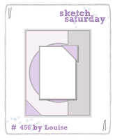
 paper play sketch:

so the shapes in the sketch (especially the strong intersecting vertical and horizonal pieces) helped me choose the paint chip and computer punch card. you can see that i flipped the sketch horizontally in order that the very handsome deer could be staring into the center of the card instead of right off the edge.


need a little more forest friend inspiration? check out the glorious projects made by the amazing SOS design team! ♥

Sunday, March 19, 2017

ALL the colors!!!

i've been playing along, when time permits, with kathy racoosin's latest 30 day coloring challenge and i'm really enjoying it. i especially love seeing what everyone else is making (via instagram) even though it has become clear to me that, realistically, i will never come close to being the "epic colorer" that kathy is. apart from the fact that i don't approach her level of talent, i also just do not have the patience. sad but true. on the other hand, i'm finding the practice valuable and fun, which is the main thing, right?


for most of my coloring, i "base coat" the largest part of the image with a tombow dualbrush pen in the lightest/highlight shade of whatever i'm coloring. then i go back in with several darker, coordinating colors of prismacolor pencil to add the shading. finally i blend with either white, or with the colorless blending pencil.
(studio g lotus stamp)


figuring out where the shading should go is probably the hardest part of the coloring process for me; especially on curvy stamps. so it's fun to draw the occasional geometric, straight lined shape, on which it's super-obvious where the shadows and highlights ought to be!


if this one looks a bit familiar, it's because you actually saw it on a completed eyelet outlet easter card earlier this week!
(hero arts oversized "happy" + pink paislee winged heart)


i'm not in love with the way i've colored these uber-cute monstas... tho i think the blue one is not too bad of a first effort at fur?
(monsta stamp set by recollections)


something i realized in the last two weeks is that i don't actually *OWN* all that many stamps which require coloring. so when i was up at paper anthology last weekend, i borrowed some of elisabeth's. this rose + heart number is a fave.
(stupidly, i didn't write down the manufacturer, but it was an older woodmounted stamp)

while i was there, i got to do the lettering on the brand new paper anthology sign. it took me a couple of tries to imitate the style of the logo... 
(which you can see right here)


after a prolonged effort at coloring precisely within the lines of tiny stamped images, i had to go a little crazy and fill a 7x10" sketchbook page with blended gelato crayon shapes... then outline and doodle with a sharpie and some posca paint pens on top. 
and yes, on these occasions, it's obviously entirely necessary to use 
EVERY. 
SINGLE. 
COLOR!!! 
♥♥♥

Friday, March 17, 2017

bling on the holidays

this fortnight we've got one of my favorite challenges at ♥JINGLE BELLES♥: the kind that involves gems, jewels, beads, pearls, glitter, stickles or any similar items. in short, for "BLING ON THE HOLIDAYS" we want to see cards with a little (or a lot, lol!) of sparkle and shine! here's what i made:

patterned paper: prima; sentiment sticker: echo park; faceted star gems: tim holtz/ideaology; sticky back rhinestones: recollections; glossy blue cardstock: paper source; ink: colorbox; adhesives: elmers brand gluetape, 3m foam tape, gluedots

i know, i know, this is really quiiiiiiite restrained in the laurniverse, isn't it? beacuse of course my first instinct was to pile on gems swirls and glitter diecuts and really go crazy! but then i found this little scrap of ancient prima paper with the dangly beads and snowflakes on it, and i thought how cool it would be to bling it up. and despite my efforts to add lots and lots... it turned out that the design was prettiest and most dramatic when i picked out just a few of the baubles, with some small faceted stars and tiny clear gems. go figure! could it be that i'm learning restraint in my middle aged years? naaaaaaaah! don't worry, i'm bound to make up for such understatement next week! :)


meanwhile stephanie has a gorgeous sparkly card that's bound to inspire you, so why not hop over to ♥JINGLE BELLES♥ and check it out right now, darlings?

Thursday, March 16, 2017

round 'em up, head 'em out!

ok, so it turns out that at the beginning of march i wrote a post featuring my last few prompts for the very fun and inspiring daisy yellow wonder 31 event... and then apparently completely forgot to hit the "publish" button?? (how does one even DO THAT?!) well anyway, here they are now:

"horizon"
i knew i wanted to use a page from this cool book of latitude charts; i did not know that some of them had interesting compass illustrations with a literal horizon line!

"fruit"
ok, i know, this one is pretty non-fruit-looking, but there's a great reason for that: it's 'cause i just totally CHEATED for this one. in my defense, i only used shades of colorburst and gelato crayon that have fruit names...
(yes, that DOES TOO count!!!)

"batik"
totally serendipitously, this was the prompt on a day i spent trying out ideas to combine gelato crayons and white embossing for an upcoming class...

"cloud"
i had the whole collage of cloud squares finished, when i thought to myself, "it just needs... something". so of course i added *FISH* 
(ok, no, i have no idea why either; let's just move along, k?)

president's day art camp
technically not a prompt, as such, this is just a collection of awesomeness made on a playdate with my niece maddie, nephew matthew, sister amie and neighbor shelby; based on this cool polka dot tutorial maddie found on pinterest! for the record, the only thing i love MORE than making art with the kids in my orbit is the fact that currently, at least half the time, it's their idea!!!

meanwhile, i've been playing along with kathy racoosin's latest 30 day coloring challenge, and assuming i remember to post it, i'll have a roundup of those pieces coming up over the weekend! :)

Tuesday, March 14, 2017

the wearing of the green

we're celebrating saint patrick this week and "the luck of the irish" at shopping our stash. but what if you're not irish OR you've already made and sent your cards? not to worry... we just want to see projects of any theme that are predominantly green. here's what i made:

chipboard and cardstock shapes: k and co; sentiment rub-ons: pink fresh studio for simon says stamp; florals: prima, petaloo, making memories, recollections; patterned paper: recollections; white cardstock: staples; adhesives: elmers brand gluetape, 3mfoam tape, gluedots, sewing machine

the start of my card was the dimensional label shape that holds the sentiment. i found an absolutely ancient, mostly-empty, pack of chipboard and cardstock shapes from k and co's "madeline" collection. and you know how sometimes when you revisit a former favorite, you think, "why did i even like this?"... well not this time! i was and am completely re-smitten. so yeah, i built the whole card around the dreamy greyish/blueish green color scheme, with accents of pink florals, which i think adds up to a nice take on "for a special lady" which is this week's challenge on the simon says stamp wednesday challenge blog.


if my card doesn't feature your favorite green, don't worry! there are lots more shades available to inspire you over at SOS!

Monday, March 13, 2017

How Many Bunnies...

...does it take to fill the Eyelet Outlet Blog? I confess that I don't know the answer; which is just as well, since however many we started with, there'd no doubt be more by the time we finished!


Then there's the question of which bunnies we'd choose, because of course the Eyelet Outlet Store has a few varieties: there are realistic looking Rabbit Brads, Pastel Rabbit Brads (both of which I've used on my cards) as well as adorable Chocolate Bunny Brads.


When it comes to tape, we've got the two I've used for my card backgrounds: Black and White Rabbit Washi and Colorful Rabbit Washi.


Not to mention cuuuute Bunny Washi and Easter Bunny Washi. I've used colorful Chevron Tape, as well, on both my cards.


I also love the Easter Bubble Brads and Spring Bubble Brads, to let my bunnies have their say.


But of course there's much more to Easter than bunnies: there are Egg Brads, Colored Egg Brads, Egg Quicklets, Oval Egg Bling, Oval Jewels, Cross Brads... well, let's just say I don't think you'll run out of choices any time soon, so head on over to the Eyelet Outlet Store and start planning your Easter cards right now!

Friday, March 10, 2017

the holly and the ivy...

 ...have lots of other holiday foliage friends, such as the evergreen, the mistletoe and even the poinsettia! any or *ALL* of those will work really well for the current greenery-centric brief at ♥JINGLE BELLES♥ and coincidentally, a few of them are on my card this week... what are the odds, eh??! :)

pine garland journal card: lawn fawn; mistletoe sticker: photoplay; holly brad, tiny pearls, wide pine tree washi, heart washi, christmas washi and skinny hearts washi: eyelet outlet; plaid patterned paper: mme; cardstock: coredinations; glossy kromekote: the paper cut; adhesives: elmers brand gluetape, 3m foam tape

this card employs my favorite trick for fast cardmaking: i've combined all ready made items, from the pine garland journal card, to the cardstock mistletoe sticker, to the uber-fab plaid paper; then added in lots of perfectly themed eyelet outlet holiday embellishments! the best way ever to have all the fun with hardly any actual WORK, lol! stephanie has also made a gorgeous card this week, why not check it out, darlings?! 

Tuesday, March 7, 2017

SOS293: all it's cracked up to be

are you curious about the title of this week's challenge at shopping our stash? or do you think you've already guessed it? ok, i won't keep you in suspense: we want to see projects that use some sort of crackle medium: crackle paint, crackle embossing paste or powder... heck i even saw a video on youtube showing how to use to use elmer's glue to make a cool crackle effect! i've used crackle embossing paste in conjunction with layers of vintage paper and i have to say i'm pretty pleased with the result.

textured birch bark giftwrap: paper source; vintage illustraton and book paper from my stash; dreamweaver white crackle embossing paste tinted with sepia colorburst and spread through penny black and tcw stencils; foliage dies: spellbinders; scraps of green patterned paper: 7 gypsies, basic grey, recollections; adhesives: elmers brand gluetape, 3m foam tape, sewing machine

i love dreamweaver's crackle embossing paste, but for the vintage vibe of this piece, bright white just wasn't the look i wanted. so i placed a scoop of the paste onto a paper plate and used a palette knife to mix in a teeny (srsly TEENY) bit of sepia colorburst pigment powder. when it was pretty well incorporated, i applied the softly sepia paste through a couple of my favorite foliage stencils, et voila!


when it had dried completely, i added my focal panel --a slightly stained and tattered illustration from a 1930's bird book-- and some diecut ferns. as soon as he saw the finished collage, lovely husband jeff dibbsed this to be his dad's birthday card! ♥


i was inspired by the foliage and colors of the march 1st curtain call challenge, "green":


meanwhile there's loads more inspiration over at SOS where both the design team and the projects definitely ARE all they're cracked up to be!!! :)