Saturday, September 30, 2017

the whole entire rainbow (in convenient blogpost form)

or, if you prefer, a roundup of mostly unrelated ColorBurst experiments from my watercolor sketchbook, as well as some random combinations i made with the set of alcohol inks i scored at the paper anthology garage sale last weekend! ;) 

i've said this a million times, so i'm sorry to be dull, but whenever i don't know what to paint i just fill a page with a shape or a pattern. that's why you see so many watercolors of circles, or plaid, or rainbow-hued lines. they are relaxing and fun to paint, plus you get to use LOTS of colors! in this case, peony, marigold, gamboge and alizarin crimson colorburst! ♥

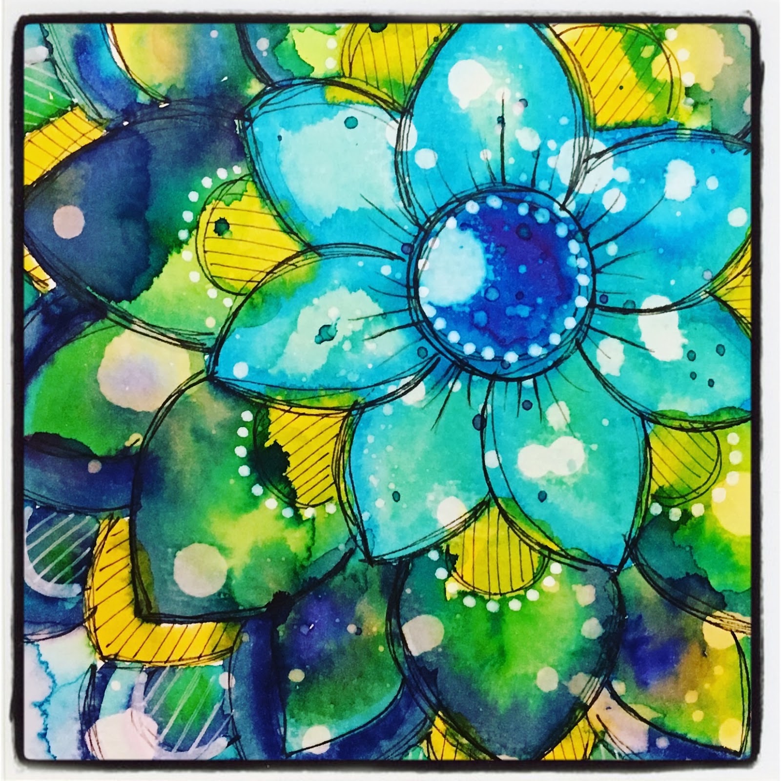
a pretty basic mandala, but i kept adding the next layer of colorburst before the last was entirely dry, to get that weird tie-dye blendy effect. which sometimes gets VERY messy, but in this case i really like it. i also tried a trick i saw in a ken oliver video: flick some drops of clear water onto your page when the piece is almost dry... let it sit for a minute, then blot it off and watch it "lift" some of the color away. i will definitely be re-visiting this idea!

this started out as colorburst flourishes, but ended up more like tentacles, lol. so i shifted gears and added loads of pen doodles. inspired by one of my all-time journal/collage artist heroines, @jenndalyn who often adds black and white doodles to colorful painted or collaged pieces in ways that make me swoon...

last weekend i lucked into an AMAZING bargain on a big set of ranger alcohol inks, blending solution and even a case to keep them in. which is hilarious, because, unlike everyone else who fell in love with these when they first came out, i kind of missed that phase and was just getting interested in the format based on a few artists i've seen on pinterest and IG recently. talk about perfect timing!!!

experimenting with the different color combos and ways to apply the ink: adding droplets straight down vs using the applicator like a pen and sliding one color around another. i can see some really loose florals happening this way.

finding out what happens when you add drops of blending solution before the ink, or to wet ink, or to almost dry ink. also kind of crushing on this combination of neutrals plus eggplant and butterscotch...
(not a sentence i can imagine typing in any other context!)

for some reason i am fascinated by geodes recently. when stephanie and i were playing with marble paints i kept trying to make geode-like creations, and now i've been trying it out with the AI's. i don't even try to fight it any more when i hit a "phase" like this, i just roll with it. something cool i discovered is that the metallic additives are rather thicker in consistency and can be used to sort of "fence off" a portion of partially dry color.

this is my favorite geode so far, and one of my favorite color combinations: 
slate + stonewashed + copper + silver

**********
i'd love to stay and talk more, but the ♥COLORS♥... they call to me!!!
hope you are having the best saturday of the whole week! :)

Friday, September 29, 2017

you're not the (EM)BOSS of me!

you may have already guessed that this fortnight's theme at ♥JINGLE BELLES♥ is embossing: dry embossing, heat embossing, embossing paste... even pre-embossed patterned paper or embellishments would qualify. so bump up the texture on your next holiday card and join us! here's what i made:

snowflake embossing folder: tim holtz/sizzix; colored and blended dry with gelato crayons from faber-castell; patterned paper and tag: my mind's eye; sticky back gems: eyelet outlet; crinkly ribbon from my stash; adhesives: elmers brand gluetape, 3m foam tape 

i confess that although i have plenty of beautiful embossing folders, i tend to forget all about them until there is a specific challenge that involves embossing. then, for a couple of weeks afterwards, i think, "that looks awesome! i should emboss more!" before re-forgetting again until the next challenge. ah well. luckily they do come along periodically and this time gave me a chance to use one of my favorite snowflake folders, on watercolor paper, then dry blend gelato crayons onto the raised snowflake areas. i've also used some beautiful hand-dyed crinkly ribbon that for some reason looks terribly odd and a bit grimey in the photo, but i assure you is quite lovely IRL. meanwhile, my layout is based on the awesome current (#482) sketch saturday:


stephanie has a jawdroppingly lovely card to show you... why not hop over to ♥JINGLE BELLES♥ and see that right now, darlings?

Wednesday, September 27, 2017

WITCH Way... to the Candy?

Halloween is fast approaching, but there's still plenty of time to grab some awesome Eyelet Outlet goodies to make your cards even more BOO-tiful! There is a spooktacular selection of seasonal brads in the shop, of which I've used only a few on this card (which is featured on the EO Blog today!) including: the brand new-- and utterly awesome-- Witch Leg Brads, Witch Hats, Mini Spiders, Mini Candy Corn, Bats and Small Eye Brads.


Of course it didn't hurt that I unearthed an ancient sheet of patterned paper that had the sweet circle icons of witches, spiders and monsters, all ready for me to embellish!


But the ideas in this card would work with loads of papers and stamps. ANY small witch (or other animal, monsta or person) could wear the Hats (the packets contain all four styles); the Small Eyes have both sizes together and could be swapped out for the eyes of many stamped creatures.


In addition to the brads on my card, there are also Monsters, full-sized Spiders (to go with the Minis), Kitten Brads (they come as a mix of black and white, each in two positions) and lots more!


There are so many good Halloween choices in the Eyelet Outlet Store it's almost *SCARY*!

Tuesday, September 26, 2017

not your mama's card

we're pushing the envelope this week at shopping our stash by making cards that are... ahem... shall we say verging on inappropriate? heck, feel free to dive right in and be completely inappropriate, off-color, a little risque... or a lot?! anything goes this week. and we promise not to tell your mama! here's what i made:

patterned paper: basic grey, glitz design, october afternoon, amy tangerine/american crafts, creative imaginations; fox brad: eyelet outlet; alphabet stamps: freckled fawn; glossy white kromekote: the paper cut; ink: colorbox; adhesives: elmers brand gluetape, 3m foam tape, sewing machine

challenges like this always stump me for a bit. because whereas my everyday conversation is often R-rated, my cards tend to be pretty clean cut for some reason. luckily i remembered that i had some adorable eyelet outlet fox brads, and there's nothing more fun than a pun, for fox sake, is there??! ;)

since i've double framed said foxy dude AND each frame is riding on a square of foam tape for added dimension, i'm jumping in with the simon says stamp wednesday challenge blog's current theme: pop it up!

need more inspiration? the SOS gang have lots of it, just like always. why not hop over and check it out, darlings? ♥

Friday, September 22, 2017

tic-tac... two?

yes, it's the second week of holiday tic-tac-toe at ♥JINGLE BELLES♥ so you still have plenty of time to link up with us! just choose a row, a column or a diagonal from the board and get creative!


this week i chose the top row: RED + SNOW + FLOWERS:


if you're thinking that my background panel seems familiar, you are not having "deja vu" it really is similar to this card from the beginning of august. it has the same combination of ken oliver poinsettia stamps, red and green colorburst and liquid metals. here's a crafty secret for ya: whenever i'm trying out new techniques or essperiments-- especially one with a lot of sequential steps-- i'll often work on more than one panel at a time. because it is not at all uncommon for me to mess up on step 8 of 9! and it's so disheartening to have to start over from the very beginning, isn't it? so i'll start two or three similar things simultaneously, thus mistakes are much less of a problem, and if i wind up with more than one success, i have "extras"! at the time i was working on this, i had tried using nuvo drops for the first time and found that it was possible to make a huuuuuuuuge mess with them, lol! i also didn't think the green embossing showed up enough, didn't get super-clear images for some of the white embossing, and realllllllllllllly hated the bits of black embossing i had tried first at the bottom of the page. i corrected all of the above on my second attempt and used that panel, un-covered-up, for the first card. when i found this sheet again, i still hated the black, so i chopped it off immediately. i also discovered that if you are pretty careful, you miiiiiight be able to scrape off recalcitrant nuvo drops. once both of those factors were gone, i found i didn't mind the green as much. the messed up white parts were still messed up, so that's where i put the big flower stack... problem solved! it's a smaller card than the first, and it's got a lot more stuff on top, but i'm pretty happy with the result.


stephanie has an awesome card to show you, and the readers' gallery is pretty fab, as well! why not hop over to ♥JINGLE BELLES♥ and check it out, darlings? 

Wednesday, September 20, 2017

Love You a Latte

It's the middle of September, which means it's time to join the lovely Amy Tsuruta and the gang at Coffee Loving Cardmakers for the Fall Coffee Lovers Bloghop!


Since I have the *PERFECT* ingredients-- Eyelet Outlet Coffee Brads-- I'm excited to jump on board.


The older I get, the more I appreciate Autumn: cooler temperatures, beautiful colors as the foliage here in the Northeast changes, and yes, a delicious warm caffeinated beverage are all things I enjoy, so I've tried to capture them in my card. I started by adorning the oversized copper "LOVE" diecut with a few paper flowers and the adorable Coffee Brads. I wanted to emphasize the sentiment a little bit more, so I added a couple of Pearl Hearts to the cups. Did you know that you can create your own custom bling and pearls, just by coloring them with alcohol ink markers? Thus I was able to make mine the perfect shade of golden yellow to coordinate with the diecut vintage paper leaves I had watercolored with all my favorite fall shades of ColorBurst. 


When it came time to build the card, I lined up some neat strips of Wide Brick Washi, Glitter Copper and Skinny Orange Tape so that I would have the perfect home for my compound sentiment. And whereas I may be the only coffee-loving American who doesn't love Pumpkin Spice flavoring in my coffee, that doesn't mean I don't love to mix a few Pumpkin Brads with my Coffee Brads, lol! 


I always start with a slightly bigger background than I think I'm going to need, so I don't run out of room. In this case, I wound up with a 3x6" offcut of woodgrain paper with the beautiful layers of tape, which seemed like the perfect size to make an extra little tag!


A few more leaves, a heart diecut, some smaller alphas and another Coffee + Pumpkin Brad pairing and I was good to go! Be sure to hop over to the Eyelet Outlet Blog and see what delights the other designers have whipped up for you this week! ♥

Tuesday, September 19, 2017

how do ya like them apples?

this week's challenge at shopping our stash is called "apple of my eye" and i'm pretty sure you'll already have sussed that we'd like to see projects which incorporate apples. it can be a loose interpretation, though, so things like apple blossom, or apple pie would also qualify. OR, although it is not yet officially sanctioned, if you manage to work in an i-phone, a macintosh computer or fiona apple, i promise to go to bat for you with the SOS judging committee and insist that's a valid representation of the theme!!! meanwhile, i  chose the classic fruit, albeit quite a stylized version. it's from the ancient SEI "fruitstand" collection (thus making it particularly stash-o-licious) the papers of which i bought several times over and have never failed to enjoy using, including right here:


the only problem with choosing your embellishments first, is then you have to go back and find something you can embellish with them! which is somewhat "cart before the horse" lol. i'm not sure i've ever seen a cupcake with an apple on top, but in fairness it's a BIG cupcake and it's got TWO layers of frosting, which hopefully will provide enough support. my top layer of icing has white embossed swirls made by one of my verrrrrry oldest and most beloved stamp sets: rhonna farrer's "flourishes" which i've had for at least ten years and maybe longer! thus i'm jumping in with the "anything goes" challenge at retro rubber!


hop on over to SOS to see the amazing creations from my dt darlings, and start planning your own apple-related masterpiece! ♥

Monday, September 18, 2017

lotus mandala: step by step

the last time i posted a handcut mandala, a few people asked how i made it, so when i used some of the fruits of saturday's uber-fun gelli printing marathon with stephanie to make another, i took photos of the steps! if you're pressed for time, these pics can also be seen as a flipagram in my instagram account.


ok, let's go!

supplies
papers, scissors, dry adhesive, a pencil, optional ink (for edges) and something you can use to draw a fairly neat circle ...in this case the cool teal protractor thing that stephanie found in an art supply store in nyc.

start with a circle
you can trace a roll of tape or a glass, or use a stencil or diecut. it's pretty helpful to start with a somewhat symmetrical circle, though. after this we'll wing it. i like inked edges, especially when i have this many competing prints, but they are completely optional.

petals
i used dry adhesive to tack my circle to another layer of paper, then sketched a petal shape or two. sometimes i divide the circle neatly into quarters, then halves, and mark all the sections; this time i just started cutting. as you can see, the lower left is pretty wonky, because i ran into the edge. it somewhat evens out in the next step though. but mostly i'm just lackadaisical about things like this, and fun is better than perfect, imo! :)

scallops
again, i attached the completed bit (circle + scallops) to the paper i wanted to use next. this time i made sure to center it, so i'd have enough room! i sketched a couple of half circles to see how they'd look. i liked them, so i cut them all the way around.

more petals
because i have A LOT of patterns here, i wanted to keep the shapes pretty simple, so i just stuck to petals, scallops and circles. in retrospect, i wish i had swapped out a few of the prints for plain cardstock, because it's pretty frenetic, but there ya go.

another circle
this time i used a compass. i don't know why i insist the circular layers be fairly precise, while the shaped layers can be wonky, but that's what i usually do, lol.

more scallops
if you don't like handcutting, you can make them by punching loads of circles and attaching them from the back, so they look like scallops. in which case you'll want to use a bit more adhesive on those layers. 

another circle
again with the compass. it's actually slightly smaller than the layer in front of it, but it peeks out from behind. 

at this point i went to the sewing machine and added a ring of machine stitching to each of the three circle layers. because i like the way it accents and outlines the shape, but also...these layers are of different paper weights, and the stitching ensures that everything will stay firmly attached. it also allows me to leave the petals and scallops loose, so i can curl them up slightly for the "lotus" effect!

finally i mounted the whole thing to one last gelli print, trimmed it into a square, matted it on black glossy cardstock, and added one more bit of stitching.

et voila! 


not into sketching or hand cutting? 
use punches, dies, doilies, templates, decorative scissors... the possibilities are endless! 
all you need are stacked layers and a little imagination!
♥♥♥

Friday, September 15, 2017

ho ho ho... tic tac toe?

it's that time again, when we bust out the ever popular holiday tic-tac-toe game at ♥JINGLE BELLES♥ and invite you to pick a row, a column, or a diagonal, then make a card using those three things and link it up!


i chose, the left hand column, "red... glitter... santa" and here's my card:

patterned paper: basic grey, doodlebug, sei; tape: eyelet outlet; glittery snowman, tree and snowflake stickers: doodlebug; doily border: crate paper; december and red stripe stickers: echo park; adhesives: elmers brand glue tape, 3m foam tape, sewing machine

ok, so the red is pretty visible, and the santa element is on that sweet eyelet outlet santa and snowman washi tape. admittedly the glitter is a little hard to see, but the doodlebug snowman and some of the the snowflakes are glittery stickers. i mention this because i know some people do not enjoy loose glitter in their homes, and these are a great "work around" as are eyelet outlet glitter washi tapes and american crafts "pow" glitter papers; both of which also diecut beautifully!


i used last week's atlantic hearts sketch, so obviously i won't be linking up with them, but it's a great sketch:


stephanie also has a wonderful card that i know will inspire you, why not hop over to ♥JINGLE BELLES♥ and enjoy that right now? 

Wednesday, September 13, 2017

Pumpkins For Everyone

Did you know that dozens of beautiful, brand new tape designs were added to the Eyelet Outlet Store in the last few weeks? Today I have a trio of cards made with what might be my favorite: Wide Pumpkin Washi! I love the soft, elegant design of this tape, the watercolor look of the pumpkins, and the fact that it's accented with pink flowers and soft green leaves.


One of my favorite "tape tricks" is to cover a piece of cardstock with it, then use it exactly like any other patterned paper, which is what I've done with the Wide Pumpkin Washi on my first card. To ground the design I added a triple row of Pink Bling Strips and topped it with a pink Paper Flower stack, accented with one of these sweet Pumpkin Brads.


I'm always excited to see Green Paper Flowers. Why? Well they're fun on their own and make a great bottom layer of a flower stack, but mostly, I like to cut them apart and use the flower petals as leaves. I've used two petals from one of the largest flowers exactly that way in my first card, but in the second, I got a little fancier, and cut some medium and small flowers apart into individual segments. Then, using a green Pearl Bling Strip as a base, I recreated the vine design on the Wide Pumpkin Washi, and used it as an accent for a multi-color flower stack.


Something that always amazes me is how different one tape can look when it's set against different backgrounds. For my third card, I applied the Wide Pumpkin Washi as an accent on my pale pink card base, then set it off with two strips of Pink Bling. This time my flowers are two shades of pink, and accented with one of the pretty new Pearl Gems.


Need even more Eyelet Outlet inspiration? In addition to daily content on the fabulous EO Blog, we have an awesome Pinterest Board with projects by all of your favorite designers, as well as an amazing Flickr Gallery!

Tuesday, September 12, 2017

emboss like a boss!

you may already have guessed that this week's challenge at shopping our stash is to incorporate *EMBOSSING* into your card, but possibly you have not realized that what we actually want to see is both dry (with a folder or stylus) AND wet (using powder or paste) embossing! don't worry, once you get your head around the idea, it's pretty easy, i promise. the proof being that even i managed to pull it off, lol!

multiple shades of colorburst pigment powders, as well as cut-n-color flower stamp and die sets "flowers 1" and "flowers 2" by ken oliver crafts; various wow and zing embossing powders; sheena douglass embossing folder: the crafter's companion; patterned papers: pink paislee, october afternoon, glitz design, lily bee; inks: ranger, prima, stewart superior, versamark; pearl brads: eyelet outlet; adhesives: elmers brand gluetape, 3m foam tape, sewing machine

it's funny, because the night before i made this card, i had re-found a bunch of ken oliver cut and color mandala flower images that i had made one day whilst minding the store at paper anthology. i had a great time stamping them over rainbows of colorburst-ed paper and then heat embossing with loads of cool embossing powders, experimenting with pretty much every color combination imaginable. (and yes, a few that turned out to be unimaginable, which will never make it onto a card!) but a bunch of them were really lovely and i was thinking that i should make them into a card... and then this challenge came up, which was perfect. for my dry embossing, i used a beautiful sheena douglass e/f that i'm embarrassed to say i rarely use, not because i don't love it (i do!) but because there are whole months that go by in which i seem to have forgotten entirely that i have a bunch of gorgeous embossing folders that i rarely use. this one has a loose floral design which paired really well, so i just added some very light inking to showcase the design without letting the colors compete too much with the mandala flowers. i kept the rest of my papers very neutral, as well, but they have a bit of tone-on-tone pattern that i tend to use in place of plain cardstock.


there's lots more inspiration to be found at SOS where my design team darlings are embossing like bosses, check it out! ♥

*my "LSS" as they used to say back in the day, is a fabulous papercrafting store called paper anthology in kenvil, morris county, new jersey. it's the store in which i teach, hang out, and occasionally "mind the store"... the latter being shorthand for days in which i get to sit in a room full of art supplies, play with all of my friend elisabeth's cool stuff, and she thinks i'm doing her the favor, lol??!?! :) :) :)

Friday, September 8, 2017

sing a song of christmas

we are still celebrating holiday music at ♥JINGLE BELLES♥ and making cards inspired by our favorite songs OR which incorporate sheet music. won't you join us?

patterned paper: simple stories, authentique, making memories; wooden heart: studio calico; plaid ribbon of unknown origin (probably off an xmas pkg, lol) from my stash; ink: colorbox; adhesives: elmers brand gluetape, 3m foam tape, 3-in-1 glue (to *securely* attach wooden heart to the bow) by beacon adhesives

i went uber-simple this week and used all ready made bits, including these cool little square icon-like journal cards which i thought were absolutely the PERFECT way to interpret this week's fab layout from sketch saturday:


stephanie also has an awesome card to show you, why not hop over to ♥JINGLE BELLES♥ and check that out right now!

Wednesday, September 6, 2017

Give Me an "L"! Give Me an "M"!

No, I'm not leading a cheer squad, just fancying up some plain monogram letters with Eyelet Outlet Washi Tape, Bling and Brads for my niece, Lindsay, and my nephew, Matthew, who both have birthdays coming up. Check it out on the Eyelet Outlet Blog!


I started with plain, kraft-colored, papier mache letters from the big box store, that are approximately 8" tall. Thanks to my colorful stash of washi tape, I had a plan that did not involve any tracing, cutting, painting, or even inking of edges! I began with the "L" since it had the more straightforward shape, and wrapped tape, in more or less spectrum order, from the top to the bottom. Since all the planes are square, this just meant lining the layers up neatly and overlapping the patterns at the back of the letter.


The only tricky bit was the tippy-top of the letter and the top and bottom of the horizontal stroke at the bottom of the "L", which I covered in neat strips of whatever tape I planned to use next on the front of the letter, in this case the Red Dots Tape and Orange Fans . In addition to those, I also used: Heart Tape, Admit One Tickets, Tape Measure, Cooking Tape, Skinny Green Stripe (two strips for a chunkier look), Blue/White Dots, Skinny Blue, Blue Check (again two strips), Cupcakes, Purple Zig Zag, Rainbow Chevron, Love, Smiley Face, and Crayons.


Once the entire letter was covered, I broke out the bling to add a little bit of sparkle! I love the brand new Fancy Long Bling Strips, they come in several styles and they're not just great looking, they stick on really well AND are flexible enough to wrap around the letter! Before I started attaching them, though, I laid out the styles I thought I wanted to use, and moved them about a bit, until I got the perfect mix. Then I cut each of the strips just slightly larger than I needed, and, with the backing still on, checked my potential placement a second time, to make sure that I would not wind up with a big, un-bend-able stone right on a corner that would not be able to lay flat. Then, I peeled and stuck on the bling strips, from front to back, trimming any overlapping stones and getting them to line up as neatly as possible at the back. The designs I used include two types of Fancy Long Bling, Green Pearl Strips and Purple Jewel Strips.


After I had the strips in place, I added some individual gems, including Blue Flower Jewels, the brand new Heart Jewel Bling and Red Heart Pearls.

The slanting lines in the center of the "M" made it a little more challenging, but not overwhelmingly so. I elected to just wind the tape around in strips, the same way I did with the "L". This means there's a little "jog" at the back of the letter where the two ends of each tape meet up, but I trimmed them neatly, in the same way each time, and decided to call it a "Design Decision"! I've got a bit of a transportation theme going on for Matthew's initial, so I incorporated multiple strips of Road Tape and Map Tape into my design. In addition I used: Blue Check, Skinny Blue, Red DotsHeart TapeSmiley Faces, Admit One, Dots, Skinny Green Stripe and Tape MeasureOnce my background was completed, I started adding vehicles to the design. I've got: a Work Truck, a Bicycle and one the brand new adorable Pickup Truck Brads that are coming to the store very very soon! Not to mention a Cupcake, some Sun and Cloud Brads and an Airplane from the Travel set. I've also got some fun sentiment Arrows from the Road Sign Set and the Bicycle Set.


You may be wondering how I got those to stay on, seeing as how I could not reach the backs to open the prongs? Since I knew the "M" was hollow, I just made a hole with my paper piercer like I would for any other project, but coated the prongs of each brad with a little bit of 3-In-1 Glue before poking the prongs into the letter. For the larger brads, I added a little more glue to the back surface of design for additional sticking power. (I should mention that all of my nieces and nephews are well above toddler age and unlikely to attempt putting monogram letters into their mouths!)

I hope you'll be inspired to try your favorite Eyelet Outlet embellishments on your next 3-D project! ♥